Lisou Village, Mae Hong Son/Gamuts, Color Profiling, and the Internet
![]()
|
• Duangjai Resort • Anyavee Railay Resort • Diamond Private Resort • Railay Bay Resort & Spa |
I have some unfortunate news to report on this project and total 100% transparency is how I feel this should be handled. My planned beneficiaries of this project, innocent very much in need children at a certain orphanage, have fallen victim to their local manager who we have found cannot currently be trusted and I doubt this is likely to change. Decisions need to be made if we're going to carry this project forward and if so who the new beneficiaries will be. I do expect this project to generate significant revenue so I take it very seriously. As you read this I'll be back in the Mae Sot area investigating further. I'll keep you informed. For now I'll still collect images with the intention of making the best most meaningful mosaics possible and as always, I'm asking for and will greatly appreciate your help with the images.
We are still accepting (and pleading for) images of children from SEA. No matter how terrible you think
they are, please send them in anyway. These images will be used to complete a set of 3 high quality mosaics which will be sold to benefit the Karen and Burmese Orphans living in the orphanages and refugee camps. The more images the better, I can
use all you have. Please take the time to go through your images for anything you think might help. If you missed the "No Place to Call Home" special, you can
click on the link and read more about this. Thank you! info@BangkokImages.com

Quick Click Links
Feature Photograph
Lisou Village, Mae Hong Son Gamuts, Color Profiling, and the Internet

Photography News of Interest
Readers Submissions
Readers Questions A Snapshot of Bangkok Images Week in Review
Infocus Blog, For The Love Of WorkT

Feature Photograph *menu
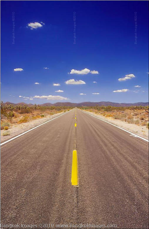
Olympus OM-4ti, 28mm F2 Zuiko @F22 Fuji Velvia 100asa (yep, slide film)
The quintessential road shot. We’ve all seen them, and we’ve all tried to make them. Photographers might spend years trying to properly pull one off. For some reason we’re drawn to road shots like moths to the light. We can’t help ourselves. It might even be in our DNA. I wouldn’t be surprised.
There is no magic formula for the perfect road shot, but there is the one rule. Capture the feeling of the road. In other words, if it’s very hot and dry then the image should impart this feeling. If the road is isolated, wet, or never ending, then your image must give the viewer these feelings.
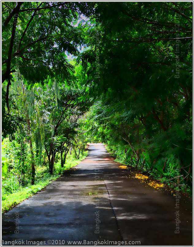
Canon 5d Mark II, 24-70mm F2.8L USM @F8 1/80th 48mm ISO 100
Color is often important, whether it be the yellow lines of the road, fall leaves, or the a subject with a sharp contrast to the rest of the frame. Color can draw the eye right down the road. Light cannot be underestimated. Sometimes it’s used to cast shadows and present a mood, other times to give the feeling of heat or dryness, and sometimes the lack of light can show rain or other inclement weather.
Road shots are one type of shot where shooting them centered usually works best, or in some cases the road shot has a subject more meaningful than the road and the subject should be centered. Texture should be considered. Does the texture help define the other elements of the composition, an example would be does the soft dreamy look of the trees add to the lonely feeling of the road in the 2nd example, or what about the coarse texture of the asphalt in relation to the hot dryness of the 1st example? There really is no such connection in the 3rd example and it’s weaker for the lack of.
Canon 5d Mark II, 24-70mm F2.8L USM @F5.6 1/200th 70mm ISO 200
The elements need to come together in a way which combine all the variables equally, a strong show of compositional strength. You just can’t go stand out there on the road with your camera and expect to make a great road shot just for showing up.
It must be the right road, the right weather, the right exposure, every compositional element must segue into the next with a smoothness that feels like you’re breathing fresh mountain air while hitting each mogul with the perfect timing the slope demands. Road shots can’t be forced, they must be earned. Do you have what it takes?
Lisou Village, Mae Hong Son *menu
At first I wasn’t sure how I was going to write this piece. I’m on record many times in this column saying as photographers and journalists we have a responsibility to accurately photograph “Thailand.” What most tourists and even seasoned journalists end up photographing and showing are the most different subjects like the Long Necked Karen (Lisou) villages, the poor, and old rural villagers. From outside the country those searching the internet to learn about Thailand then see a disproportionate number of these images giving the impression that Thailand is some newly discovered country which hasn’t changed in thousands of years. In truth, a great part of Thailand is every bit as modern as any western country.
A well balanced portfolio of Thailand, in my opinion, should represent the entire population and its demographics.
Canon 5d Mark II, 24-70mm F2.8L USM @F8 1/500th 42mm ISO 100
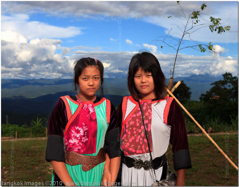
Perhaps the most photographed and talked about group of people in Thailand are the long-necked Karens, of which the Lisou are part. In fact, only a small number of the Lisou practice these customs and most are no more different than the clothes they wear and the more common differences in regional physical features. The real way to tell the Lisou apart from other Lisou, is by the colors and design of the colorful dresses and suits they wear.
Canon 5d Mark II, 24-70mm F2.8L USM @F2.8 1/600th 70mm ISO 400
The Karens within Thailand’s Lisou community (not including the tens of thousands of Burmese Karen refugees) number roughly 40,000 and are spread out in small villages throughout the region. I visited one small village near the outskirts of Pai and could immediately see they weren’t well represented. A casual observer filtering through galleries of images on Thailand can be forgiven for not knowing most of the people in these villages live in extreme poverty using centuries old traditional methods to produce food, clothing, and other necessary items of subsistence.
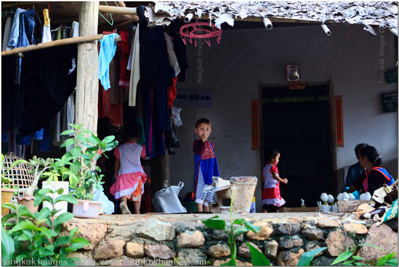
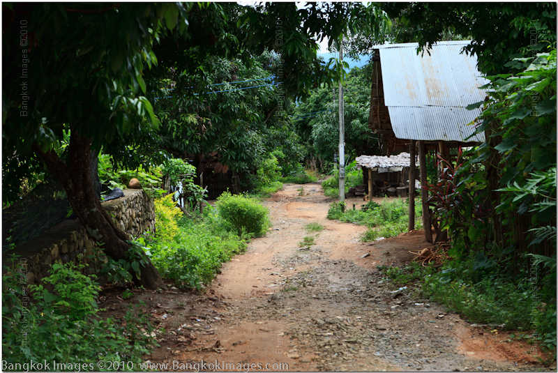
It only took me a few minutes to know I didn’t want to photograph the common colorful holiday ceremonies or shows put on for tourists. Instead, I wanted to roam the backstreets of the actual village where your average Lisou villager lives and show you the true flavor of these people. How they live their daily lives when not putting on shows for tourists. If you checked in to gawk at the Long Necks then you might be disappointed initially, but if you stay with me a little longer you’ll know a lot more about how these people really live and what they face in their day to day struggle.
Canon 5d Mark II, 24-70mm F2.8L USM @F8 1/50th 62mm ISO 200
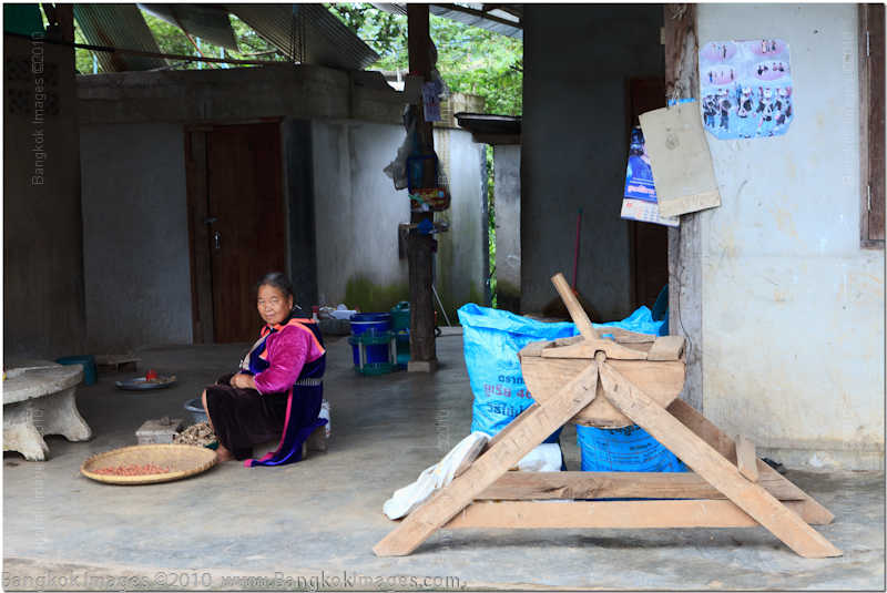
The picture above was captured far back in the village where you won’t find any tourists. A Lisou woman sits on a low stool processing local crops and in the foreground you can see bags of rice and a wooden appliance used to hold and distribute the rice from. Please excuse my ignorance on the exact names of the produce or machines as I wasn’t there long enough to gather this information.
Canon 5d Mark II, 24-70mm F2.8L USM @F8 1/60th 70mm ISO 400
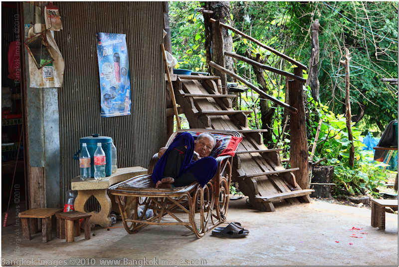
This elderly man napping outside his house is a common sight. Throughout the village I observed children, the elderly, older women, but nowhere could I find the youngest women or any man older than 15 but younger than 45-50. I was told they were away “working.” Usually when these demographics are missing from villages the youngest women are somewhere being sexually exploited and the men physically exploited. Indeed, traveling through the region I noticed such men on construction sites and in the fields, and was told of places where I might find the women.

Canon 5d Mark II, 24-70mm F2.8L USM @F8 1/200th 55mm ISO 100
The lone exception. An actual mother with her child where the mother was under 35-40. She was happy to be photographed and her young son looked on with curiosity.
Canon 5d Mark II, 24-70mm F2.8L USM @F8 1/200th 42mm ISO 100
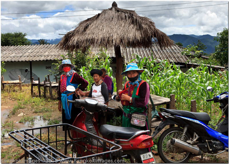
This group of older ladies was gathered outside a store which appeared to be delivering goods around the area via motorsais with caged sidecars.
Canon 5d Mark II, 24-70mm F2.8L USM @F8 1/40th 40mm ISO 320
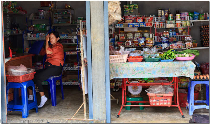
Small village stores are common everywhere in Thailand and the Lisou village was no exception. This small store was being run by and older lady and didn’t seem to offer many items.
Canon 5d Mark II, 24-70mm F2.8L USM @F8 1/100th 62mm ISO 100
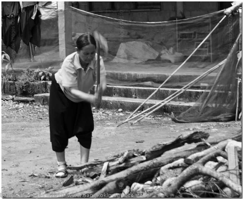
There is a sort of energy hierarchy throughout Thailand and I wasn’t surprised to see the Lisou were at the poorest end. The most privileged in Thailand cook and run most of their homes with electricity, next down are those using propane (LPG), further down are those using actual coal, and at the extreme edge of poverty you’ll still find rural villagers using ‘found’ wood from the local forests. This lady wasn’t splitting logs, she was splitting small pieces of found wood into even smaller pieces to offer for sale to the other villagers.
Canon 5d Mark II, 24-70mm F2.8L USM @F8 1/60th 70mm ISO 100
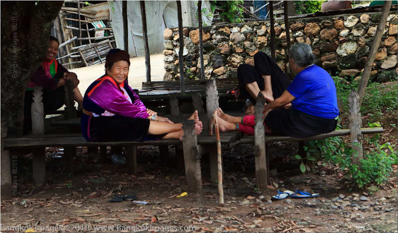
These older ladies were taking an afternoon break and were all smiles and were almost posing for us. Notice the stone wall in the background? I couldn’t help but notice the local construction used a very high percentage of locally available products which could be gathered from the immediate forests and mountains. Rocks, bamboo, leaf roofs, mud walls, very few commercial building materials could be found.
Canon 5d Mark II, 24-70mm F2.8L USM @F8 1/100th 46mm ISO 100
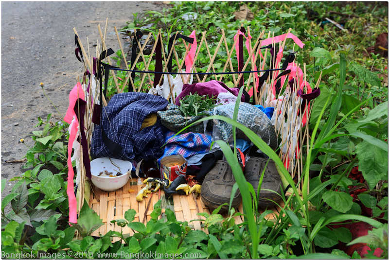
Canon 5d Mark II, 24-70mm F2.8L USM @F8 1/60th 25mm ISO 100
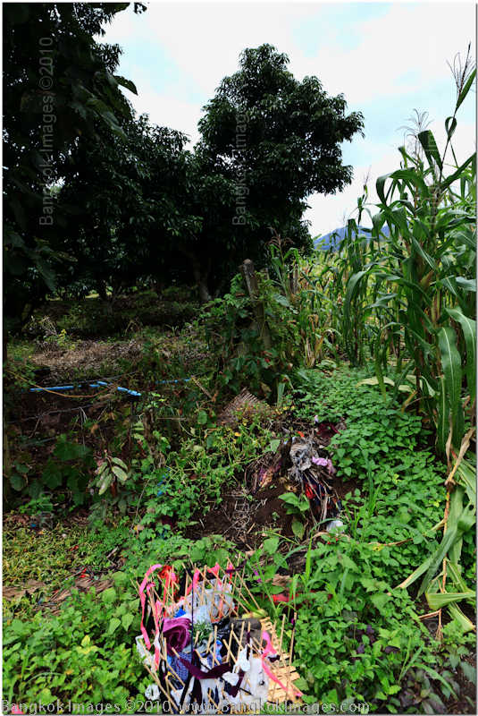
These two images were strange and I couldn’t find anyone who could explain. The small handmade container holds shoes, shirts, bowls and some produce items. It sat by the edge of a cornfield, almost as if the workers took off their shoes and shirts and left them here for safety before entering the fields.
Canon 5d Mark II, 24-70mm F2.8L USM @F8 1/250th 24mm ISO 100
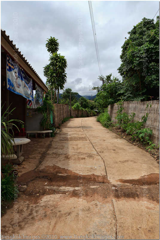
You can often tell a lot about a village from its roads. The material of construction, what types of homes are near which roads, and what they connect. Most roads were dirt or gravel, but other roads were made from concrete and winded between high fences blocking the view of the nicest homes in the village. I couldn’t ascertain if these specific roads were built by government services or privately, but I’m guessing privately. If they were built by government services they were probably built at the request of the property owners.
Canon 5d Mark II, 24-70mm F2.8L USM @F8 1/40th 45mm ISO 125
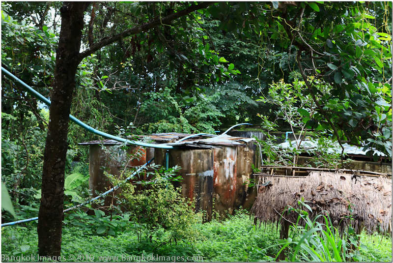
This is the village's water supply and was located up above the greater part of the village. Concrete holding tanks with inadequate wood and tin covers using gravity fed 2 inch lines to provide water to the residents below. Two 2 inch lines would not provide much water at all considering the number of structures in the village.
Canon 5d Mark II, 24-70mm F2.8L USM @F8 1/100th 38mm ISO 100
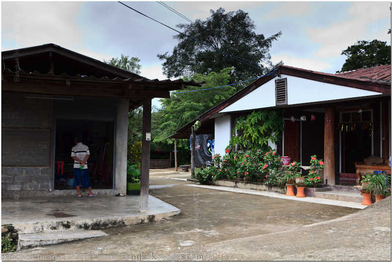
These were two of the nicer homes complete with a carport (far end of the house) and a cement drive. The home right next to it is barren in comparison sporting windowless cement block construction and an open roof.
Canon 5d Mark II, 24-70mm F2.8L USM @F8 1/100th 63mm ISO 100
This is a good example of a more common road, a fence and outbuildings made from local materials, and not much else. At first you might not notice the lack of power poles and cables but it doesn’t take long until you notice most houses aren’t supplied, and the few which are will invariably be the nicest structures in the village.
Canon 5d Mark II, 24-70mm F2.8L USM @F8 1/80th 24mm ISO 100
This is one of the nicer homes housing field workers. Because these villages are built on mountainsides you’ll find small terraced fields everywhere you look.
Canon 5d Mark II, 24-70mm F2.8L USM @F8 1/80th 70mm ISO 320
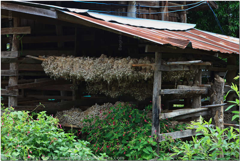
No, these aren’t poppies. This is wild garlic and a very valuable harvest for the locals. They’re put out to “dry” under these lean-to structures which I’m guessing must take a long time because it’s always raining and wet.
Canon 5d Mark II, 24-70mm F2.8L USM @F8 1/80th 24mm ISO 100
Canon 5d Mark II, 24-70mm F2.8L USM @F8 1/60th 60mm ISO 250
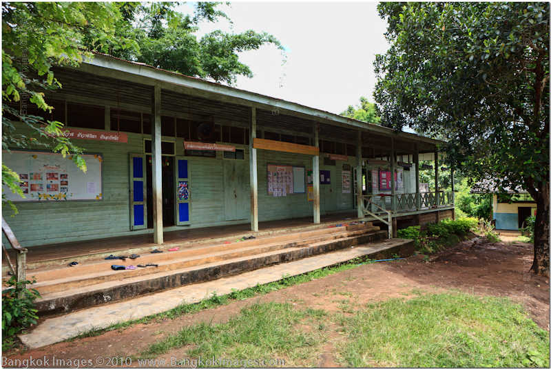
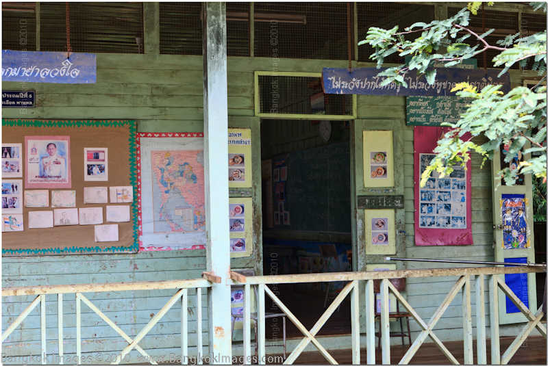
It was a relief to find a local schoolhouse. It appears to be an “all-grade” school house. The school was open, the faculty was present, but there were no children on this non-holiday weekday which I found a bit distressing. You didn’t see many school age children at all in this village which made me wonder where they were. Three visits in three days, all on weekdays during school hours, but no children.
Canon 5d Mark II, 24-70mm F2.8L USM @F8 1/125th 55mm ISO 100
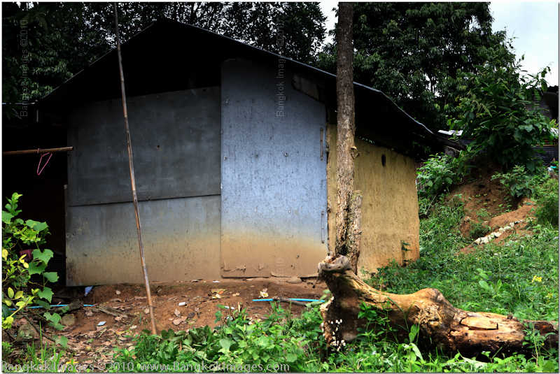
This is interesting. A traditional house built from mud walls with galvanized steel functioning as a door, a prop-up window for good weather, and a small porthole high on the mud wall. I’m guessing it’s there to let smoke escape from the cooking fires, serve as the only light source during daylight hours, and it’s height keeps the local critters from getting inside. Notice there is no power wires?
Canon 5d Mark II, 24-70mm F2.8L USM @F8 1/250th 38mm ISO 100
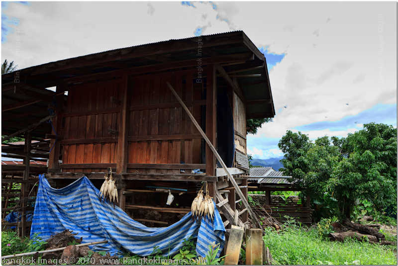
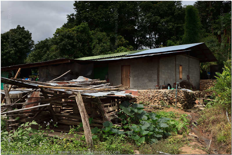
A better build home constructed from cement blocks, corrugated tin roof, a single wood covered window opening, and a fairly large enclosure for chickens there in the foreground. Again, local river rocks were used to build the foundation and fences.
Canon 5d Mark II, 24-70mm F2.8L USM @F8 1/200th 46mm ISO 100
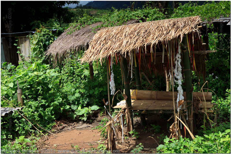
A cozy place to keep out of the rain? What you can’t see is that behind this structure there are 4-5 other outbuildings built up against a hillside. The outbuilding are used to store and process the locally grown produce during the harvest season.
Canon 5d Mark II, 24-70mm F2.8L USM @F8 1/60th 70mm ISO 125
Our last picture was of the only school aged child I saw in the village. She was friendly enough, but pretty hyper and obviously protected by the older ladies. I wonder if she was somehow ‘slower’ than the other children who were being kept elsewhere doing I’m not sure what.
As you drive through the village you’ll notice some cultural differences. It appears much cleaner than your local Thai village. You won’t find garbage anywhere. I’m sure they don’t produce as much garbage, but they certainly seem better at rendering it than most. I didn’t see any dogs or cats either. Old men grouped with other old men, and old ladies grouped with other old ladies.
These villagers didn’t seem adverse to work either. For what they had, it was remarkably well-maintained, free of garbage and junk, and everyone seemed to be busy or have some sort of job most of the time. Most seemed reserved, while only a few appeared extraverted. My guess is we were the first white faces they’d seen in these areas in a long time if ever.
Karens are good at “making do..” Despite whatever hardships they face I’ve always observed them with high morale and working hard. Their homes always seem clean and well kept, the grounds of their homes are just as well maintained, and yet there are signs of poverty and perhaps oppression everywhere I look. It would be hard not to find a high level of respect for these people.
Gamuts, Color Profiling, and the Internet *menu
Last week I went over Monitor Basics and the week before I reviewed an inexpensive but adequate 24” LED Backlit LCD, the Samsung BX2450. This week we’re going to put the pieces together and talk about how they relate to gamuts, color profiling our monitors, and how we process images in our processing software such as Lightroom or Photoshop and then how we see the same image when posted on the web, made into a print, or on our own monitors at home. This topic is very complex and books have been written on the subjects, but hopefully this piece can bring it all together for you if I can manage to keep it brief and organized.
Gamuts/Color Spaces
Last week I used the analogy of a gamut being like a box of crayons. Some boxes of crayons have 16 crayons, others 32, some 64, and some even have 128 or more. Each crayon is a certain color and the boxes of crayons can be configured in an infinite number of ways.
More accurately, a gamut is a subset of the entire color spectrum. Ideally we’d always want to use the full spectrum but the technology and electronics necessary to reproduce the full spectrum on our monitors, printers, and other mediums would be cost prohibitive. So, we work with equipment which can reproduce subsets.
A color space is that part of the gamut which can be displayed accurately on a given device. Individual colors in these gamuts can and often do overlap. So in practice color spaces while different, are often subsets (at least in part) of other color spaces.
Some common color spaces and their uses:
sRGB – This is the most common color space web users and photographers will deal with. If you need to ask yourself which color space to use when setting up your system, then use sRGB. RGB of course stands for the three primary colors of red, green and blue. Mixtures of these three colors produce all the other colors. sRGB is the standard the web is based on, it’s the color space most commercial photo print machines are set up to reproduce, and it’s a relatively small but entirely adequate color gamut for most any use. If in doubt, use sRGB.
Adobe98 – This color space includes more of the sRGB gamut, but then extends it outwards another 10 percent or so in most directions. It’s simply a bigger color space. For years professionals who owned their own art ink jet printers set their systems up in Adobe98 because their printers were capable of reproducing the Adobe98 color space. Adobe98 is one of the two choices in the setup menu of every DSLR, the other is sRGB. Until recently, recently being the last 2-3 years, even professional grade monitors were not capable of reproducing the entire Adobe98 gamut.
ProPhoto – This is the new darling of the professional community. It’s even a larger gamut than Adobe98 and if you want to absolutely work with as many colors as possible with your DSLR you’ll want to work with ProPhoto. Sure, your monitor won’t be able to display all of it, or your printer either, but it sits right in there with a nice balance inclusive of sRGB and Adobe98. This gamut is growing in popularity and it’s just a matter of time before it’s the gamut we reference in relation to our monitors and printers.
CMYK – This is a subtractive color space based on the four colors most commonly used in professional prepress, or printing press. Cyan, Magenta, Yellow and Key black. CMYK. Commercial and advertising photographers have been using CMYK for many years to process their images being sent out for commercial printing in magazines, brochures, and other printed media.

Others – There are many other color spaces, but these are the four most commonly encountered by photographers so we’ll limit ourselves to these. Just be aware there are more and you’ll see them for televisions, movie cameras, and other devices.
Color Profiling
Color profiling is simply the act of adjusting our monitors, so that the colors and luminance we see displayed on the monitor, is the same as the print that comes off our printer, or as we post on the web. If we post our image on the web, we want to ensure others viewing the web see the image as we intended. We can also color profile scanners and any device that processes an image.
For the sake of practicality we only worry about color profiling the devices we actually use, and then only for the purposes we need. For instance, web display, standard print machines, our own art ink jet printers, or even professional art ink jet printers. And of course CMYK if we’re commercial photographers and out images will be printed in magazines or other prepress output.
When profiling your own system at home, ask yourself what you’ll be doing most of the time. If you’ll be posting images on the internet and getting prints made at your local printers (I’d imagine most of you) then choose the sRGB color space and profile your monitor to sRGB specs. If you’ll mostly be making prints on your own art ink jet at home, or at a professional printers, then consider Adobe98 and profiling to those specs.
As we’ve mentioned before, we color profile with the aid of a hardware colorimeter which looks a lot like a mouse and plugs into your USB port, and matching software. This is what you’d use if you’re using a regular monitor that utilizes a video card LUT (look up table). How it works, is the software guides you through a process where it sends out colors and different luminance values to your monitor, the colorimeter reads these colors and different luminance values, and then builds a color profile which is essentially the values which go into the LUT.
During this process you’ll need to adjust the brightness/contrast/red/green/blue controls on the monitor’s OSD to complete this profile. The values in your LUT tell the video card how to adjust itself to send the most accurate output to the monitor. This means, only one profile can be used without repeating this entire profiling process over again which can be a very time consuming process. It is not practical to go through this process just to change the color profile, unless you’ll be using that profile for a long enough period to offset the 30-120 minutes of work it takes to complete the profile. I recommendXrite’s i1Display 2 package which includes a decent colorimeter and software at a good price.

Another type of monitor would be a professional monitor like the NEC Spectraview (LCD2690uxi2 for example, or the new PA241w, among others) These monitors have an internal LUT. This means you can send the profile directly to the monitor and it will output that profile directly to the screen effectively taking the video card out of the equation.
As a bonus, most video cards only hold 8 bit LUT’s while most pro monitors hold 12-14 bit LUT’s. The difference is a few million shades. A bigger bonus, would be the ability to upload different LUT’s to the monitor via a click of the mouse, and the display will then reflect that LUT, and you can usually have many profile values and change which profile your monitor is outputting on demand. This is an extremely useful tool to the professional photographer, or anyone who needs more than one color space for their work. In this realm of equipment the manufacturers usually either provide or sell a matching colorimeter and software which best suits their system. For the NEC’s this would be the Spectraview II package, of SV II.
Putting It All Together, What You See on The Web or on Print
This is the meat of the subject. If you’ve stuck with me throughMonitor Basics, and this article, by now you should easily be able to understand this last part. The picture should become clear and the light bulb turned on. This last section is where we put it all together.
Let’s invent a photographer and call him Joe. Photographer Joe. He uses a 4-5 year old average laptop, a Canon 5d Mark II, and some nice lenses. His entire focus is taking nice pictures of Thailand and sharing them on his website. Photographer Joe has noticed that when processing the picture and looking at it in Lightroom or Photoshop, and he then puts it on his website, that the two pictures often don’t match. Sometimes they do, sometimes they’re close, and sometimes they’re way off. He’s understandably frustrated.
Photographer Joe schedules a workshop with BKKSteve and tells him “I want to learn to color profile my laptop so that what I see in Photoshop/Lightroom is what the image looks like on my website.” BKKSteve replies “I can help you, but there are things you must understand and here they are: "
- Your laptop is probably only displaying 40-60% of the sRGB color space. You are simply not able to see all the colors in the image you’re processing. To make matters worse, the viewers of your website who are often using the same 4-5 year old laptop which also can only see 40-60% of the sRGB gamut BUT they’re probably not seeing the same 40-60% you are. They’re seeing a 40-60% subset of the sRGB color gamut just as you are, but their 40-60% coverage will not be the same as yours.
- The portion of the gamut you can’t see, can make the image look very different to someone who can see it. Especially if they then can’t see a portion of the gamut you can see.
- Your internet browser, Firefox, Internet Explorer, Safari, Opera, each one has different capabilities to display a ‘tagged’ image. For instance, Internet Explorer IS NOT color managed at all. Firefox is. Safari is.
Photographer Joe “What’s “tagging” and image, and what can I do for the least investment?” BKKSteve “It’s all about choices and economics. Here are some things you must understand.”
- “Tagged” means the image has color space information embedded which a viewer or a browser which is your viewer on the internet, can read. It reads the embedded color space information and passes that information on to your operating system letting it adjust the colors to your system profile.
- You’ll need to color profile your monitor to a “standard” others are using. The web is sRGB. You’ll need to calibrate/profile your system to sRGB.
- You really should consider investing in an external monitor for your laptop which can display a much higher percentage of the sRGB color space. If it can display 90%, then you can accurately adjust 90%. 90% means most people will see your images at least 90% as you intended. 90% is a good number. Even 75-80% is good. 40-50% isn’t good at all. There is a world of difference between these numbers.
Photographer Joe “Most people viewing my website aren’t ‘color profiled’, so why does it matter if I am?”
BKKSteve “This is a good question. Let me explain:”
The internet is a “standard” of sRGB which was agreed upon by Microsoft, Hewlett Packard, and some others way back in the mid-90’s. Since then, all manufacturers have agreed to produce their monitors as close to this standard as is economically feasible for the individual product. Depending on manufacturing tolerances and produce quality, any given monitor is in the ballpark, but can vary significantly. This is why as photographers we profile our monitors, so we can ensure that at least we are as close to this standard as possible.
Think if it this way. If your monitor is 10% off the standard in one direction, and you’re only seeing 40-60% of the gamut, your total error from the standard could be as much as 25-30%. Now, what if the viewer was also off by the very same amount, but in a different direction? Now we have 50-60% error. By keeping your own images to a industry standard and profiling to ensure their accuracy, you can help reduce that error margin significantly. The viewer will then only be viewing your image the degree their machine is off, and not a sum of both yours and their machines. Do you see it now?
Photographer Joe “I never realized how important color profiling was, or how it could add to the error of the systems my site viewers are using.” “What can I recommend to my viewers to be as accurate as possible and to be able to see my images, because we know the average person isn’t going to invest in profiling equipment. I can do my part, but what can they do?”
BKKSteve “I would recommend they use a color managed browser and to check out this web page to test their current system to make sure they’re picking up the tagged image as you made the image.”
Photographer Joe “Okay, I can do that. And the investment in the xrite i1Display2 color profiling package seems a good deal. And maybe I can even spring baht 10,000 for a decent monitor. But why what advantages will someone get if they go the entire 40 yards and buys a professional monitor with an internal LUT capability?”
BKKSteve “Okay, I’ll explain how I personally use my professional imaging monitors and why the internal LUT’s are valuable to me. For others this might not be the same, each person’s needs are different. Here goes:”
Multiple Monitors
I work with two monitors. Many studies have been done showing productivity greatly increases with more screen real estate, and a second monitor. The point of diminishing returns is reached quickly with the third monitor for most people.
With more than one monitor, you’ll either need a separate graphics for each video card LUT capable monitor, or if professional monitors with internal LUT’s you just need two monitor outputs period.
sRGB Emulation
Remember you told me some of your images matched, some were close, and some were really off when viewed on the web? This is because different images use different portions of the sRGB gamut. Depending on which part of the gamut a certain image is using, and how much of the gamut you can see, will determine how they ‘appear’ to you. But there’s more.
Even if a monitor is capable of displaying 100% of the sRGB gamut, and is profiled, there can still be errors. You see, if just a portion of the gamut escapes the confines of the sRGB gamut, this can create what most refer to as a color cast. This can be very frustrating, because even if you spend a lot of money for good Dell U2711 monitors and have great video cards, and then profile them correctly, there is no mechanism built in that LIMITS the gamut to ONLY sRGB. So extraneous colors can escape causing a color cast.
This has been a huge problem for web imaging professionals for years with no solution until recently. Now NEC, Lacie, and Eizo have all come out with a form of “sRGB emulation” modes. What this does is clamp down on the sRGB gamut, or rather limit it to only the sRGB gamut. This creates a super accurate image. Since I went to the NEC’s my images in Lightroom or Photoshop now match what I see on the web 100%! Finally some relief. I can’t tell you how good this feels.
But here’s the bad part. As I go through my galleries and other online content I’ve posted over the years, I notice much of it looks close, but a lot is really off. I’ll need to spend a lot of time going back and correcting these images. But once I have them corrected, then I’ll have the system licked.
Why I Use Different Color Spaces
Before I went to the NEC’s with internal LUT’s things worked like this: I’d color profile to a standard somewhere in the middle of the work I did, and then when I had a different type of work I’d guess how much I needed to adjust the levels and change the colors. It was always a guess, but with a lot of experience I tended to get pretty close. When I had my studio, I’d set up one system for in house printing so there was no guessing, another complete system for work that went out to a lab, and yet a third system for commercial work. And guess what? A fourth system for web work. This was the only way I could get things right on a professional level. A complete different workstation for each color space I had to work with. And like I said, even then my web work was never spot on.
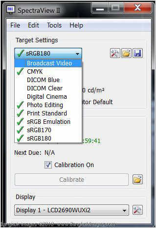
Now life is different. I have one main workstation. It has two NEC LCD2690uxi2 monitors. I use the Spectraview II colorimeter and software, and have created profiles in sRGB, CMYK, Adobe98, ProPhoto, for in house printing, for one of my favorite out of house professional printers, and for another of my out of house professional printers.
When I sit down to process an image, I simply ask myself what I’m going to do with that image. Is it for my website, for my own printer, a commercial client, and then whatever it’s for, I then choose the right profile. With a click of my mouse I can set my workstation to any of these profiles and be 100% accurate.
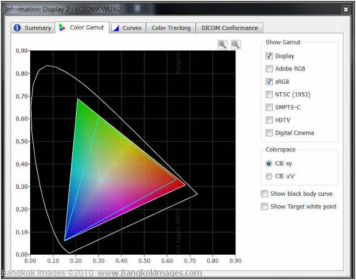
Look at this image below, see the green line triangle? That’s an estimate of the sRGB gamut. See the entire color triangle? That’s the gamut I have set to sRGB emulation. It follows the sRGB gamut perfectly.
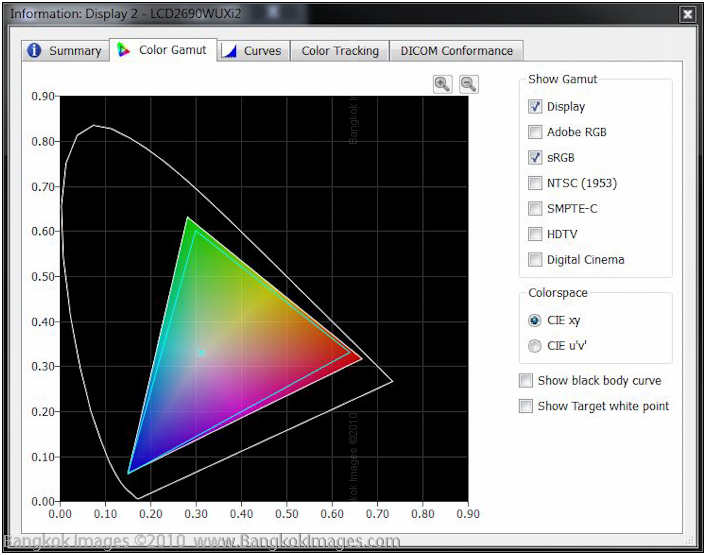
On the image below, notice the yellow triangle? That’s the Adobe98 gamut, but my workstation is still set to the sRGB mode.
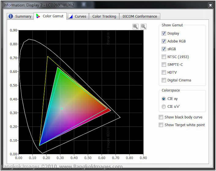
Below, now with a click of the mouse my monitor has readjusted to Adobe98! See how much bigger the gamut is?

Below, see the green sRGB triangle inside the much larger Adobe98 gamut? Without an sRGB emulation mode I’d have the sRGB colors right, but all the extra colors would be escaping and creating color casts on my images.
Below, you can see where my target (ideal) sRGB is 6506k (kelvin), which is a perfect CIE, x,y reading of 0.313, 0.329. After calibration/profiling I’m now
at 6507k, with a perfect CIE, x, y reading of 0.313, 0.329. This is extremely close. The extremely small difference could never be seen by the naked eye.
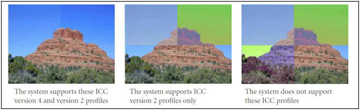
Remember what I said about different browsers? Look at the image below. The first image shows what an image would look like if it had both ICC 2 and 4 profiles and was being viewed correctly, the second shows if it only showed v2 correctly, and the third what it would look like if not showing anything correctly. A real mess!
Now, you can easily see how useful a professional standard monitor with internal LUT’s can be to someone who uses more than one standard. The biggest mistake someone can make is thinking if they profile their monitor, then it’s good for all uses. It just doesn’t work that way.
Whether or not the investment is worth it to you is a personal decision. And you still need to consider that a professional grade monitor is just plain more accurate and enjoyable to use in every respect. They’re a real pleasure to use.
Photographer Joe “Wow, that’s a lot of information. I need to decide what is worth it to me.”
Summary
This is a huge subject, and I’ve already mentioned books have been written on just portions of the subject. There is no way I can write a comprehensive article on monitors and color profiling in this sort of venue, and I have no desire to write a book.
What I’d recommend, is if you’re a hobbyist, is to seriously consider an inexpensive monitor like the Samsung BX2450. I’d recommend you buy the Xrite i1Display2 profiling hardware and software, and profile as accurately as you can to sRGB. Set your cameras, computer, printer, all to sRGB.
If you’re a more serious photographer then a nice S-IPS wide-gamut consumer model like the Dell U2711 or Viewsonic VP2365wb would be great. Use the same Xrite i1Display2 equipment.
If you’re a very serious photographer, or just have the money and want to do it, then invest in some great professional monitors like the NEC LCD2690uxi2’s or the NEC PA271w’s. Buy their SVII profiling colorimeter and software. Once you use these, you’ll never go back. You’ll never realize just how good they are, and how easy they make things, until you’ve used them a few weeks.
This is a tough and confusing subject. It’s explained differently, and often wrongly, on the web at 1000’s of links. People argue and debate the subject on 100’s of photography forums. Some arguments get quite heated.
I’ve had not a small number of fellow professionals hire me, and either bring their systems to my home, or I go to theirs, and help them set up the color correctly. The subject can be that tough. Maybe it’s not that it’s tough, more than it’s an intensive and steep learning curve and some people just rather not climb that curve. They just want their system to work. So they call me and I make it work for them, and I’m very clear as to that particular systems limitations.
Some of the toughest calls I get are from Mac people. They’re used to Mac’s making great products and being well thought out, and just can’t accept the truth about Mac monitors.. which is generally, they’re of a very low quality. Others with Imacs become frustrated when they want to connect a better monitor, but then learn their video card can only support a color profile to one of those monitors.
There’s a ton of information out there, YouTube tutorials, books, articles, and advice from the manufacturers (their low paid help almost always give you the wrong answers, unfortunate but true). I’ve tried to lay out the most important points, while not hitting many of the smaller points at all. I hope this has been of some use.
Photography News of Interest *menu
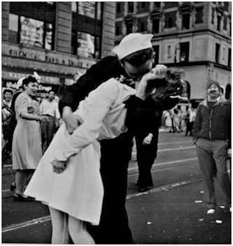
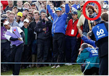
Remember the Cigar Guy from last weeks news? What an odd looking character who shot to instant but short term fame when he was captured in the background of a Tiger Woods sports photo sporting a coon hat, Groucho style mustache, and a huge cigar. People were having fun cutting and pasting his picture in any number of funny ways and posting them on the web. Talk about going viral! Now he’s been identified! Well, the coon hat turned out to be a ‘pony-tail wig’ (there’s a difference?), and the mustache was fake too! 30 year old Rupesh Shingadia who still lives in his moms basement in London (who would have guessed..) was just trying to impersonate another golfer. You’ll have to read the article to find out who.
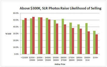
This doesn’t surprise me, but if you’re trying to sell your house you’ll want to know that images taken with DSLRs and the better cameras, sold faster and for more money than those using more unprofessional images. I’m always trying to tell clients who will listen that investing in a proper presentation, whether it be a great website or great pictures or even a great appearance, will give them a significant edge on the competition.

Irina Davis’ Playful Pin-Up Shoots from the 1950’s! This is a great article about Irina Davis, a Russian-born photographer who created not only her own style, but her own genre as well! You really need to check out this link to a gallery of 77 of her images. Great stuff!


This is a great collection of photography projects for kids. Definitely, get your kids involved in your hobbies as early as possible and you’ll possibly be closely sharing your passions throughout your lives. Check out this article for some fun project ideas.
The Art of the Hot Rod! A Photography exhibit from Peter Harholdt. Straight from Hot Rod Magazine, an article about Peter Harholdt’s hot rod photography. I’ve seen his work before and it’s really good.

Capture it: Tips for photographing the fall colors. A short and sweet article with some timely tips for capturing fall colors. Ok, I’ll be honest, they call this an “article?” Really? It can’t be..

Sony came out with a major firmware update for it’s NEX-3 and NEX-5 any day now, so it’s great that Digital Photography Review has posted their first impressions of the upgrade with detailed information you’ll find useful. You can find the firmware here.
Canon releases a new firmware update for its EOS Rebel XS/EOS 1000D. You can get it here.
Readers Submissions *menu
Hi Steve,
I just read your latest articles. Don’t know if this mail will make your “spark flicker”, but it’s about time I said “hello” again anyway…
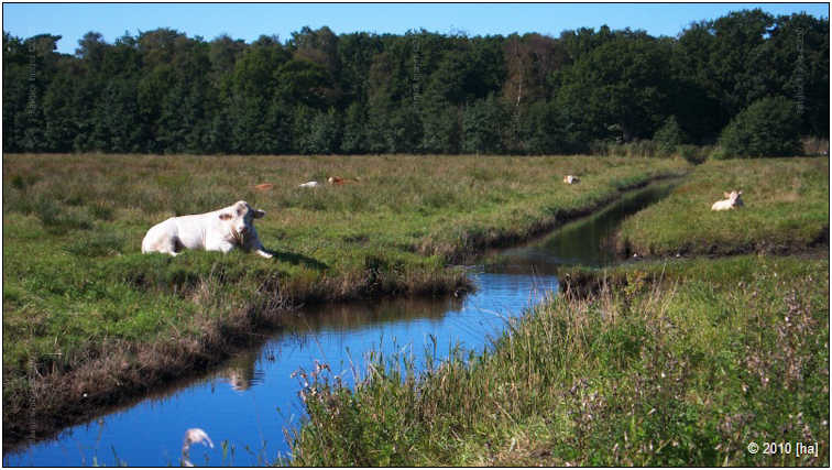
In the meantime, I included a couple of pictures I took during a recent trip to Northern Germany; for your interest, comments, or publication as a readers’ contribution, whatever you consider suitable.
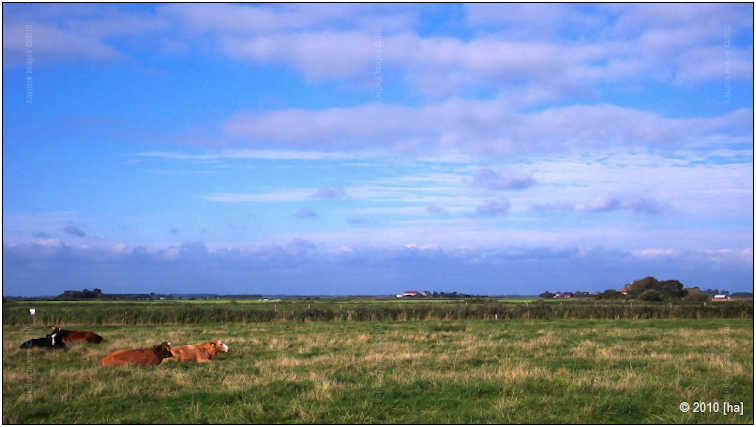
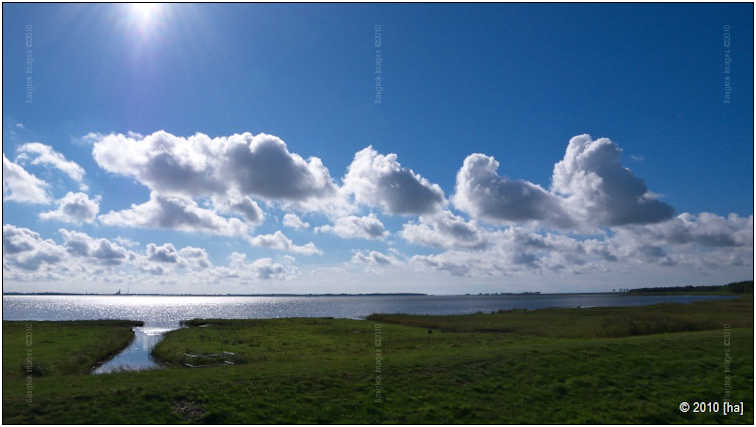
This isn’t really that special, but I think it showcases pretty well the flat, wide-open landscapes that you have up there.
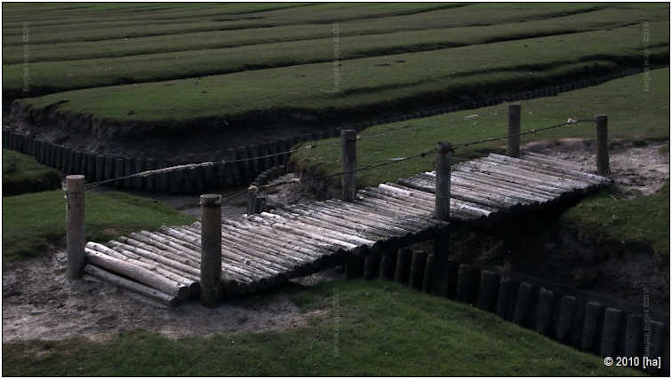
A detail from an area where land reclamation is on its way.
These speak for themselves.
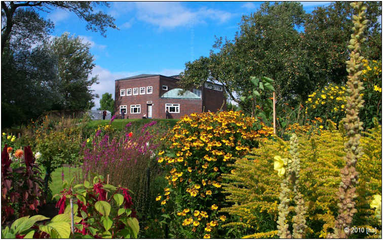
This shows Seebüll, the former home and now museum of famous German-Danish painter Emil Nolde (not sure that this one may be published as it was taken from private grounds). Nolde liked to paint flowers, so wherever he lived, he created sumptuous flower gardens as subjects for his paintings.
A detail from his garden.
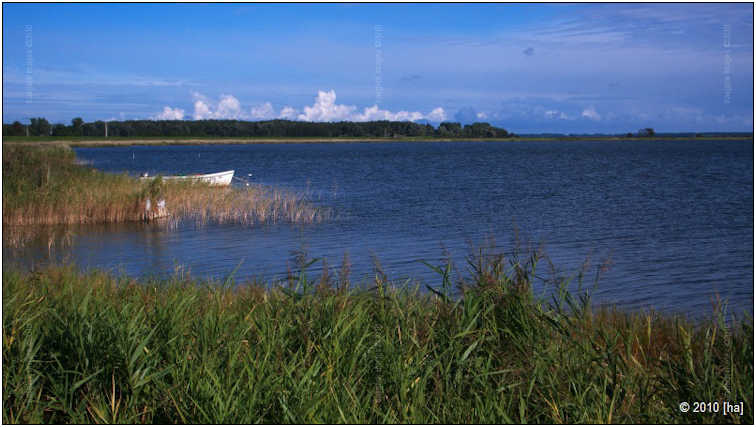
These shows the scenery around the Saaler Bodden, on one of the few days with good weather.
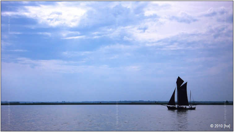
“Zeesboot” on the Saaler Bodden, the typical sailboat of this region that once upon a time was used for all transportation and fishing purposes but these days, of course, serves for recreation and tourism only.
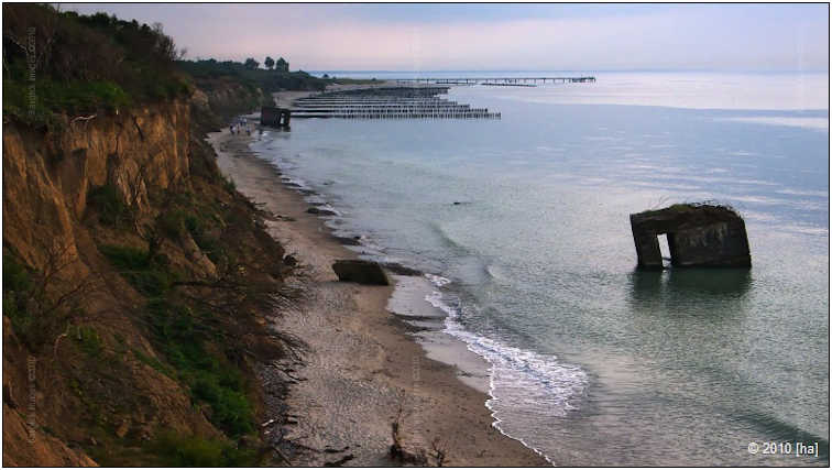
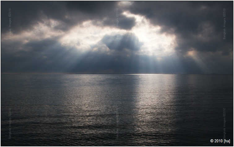
This is special. I liked this view very much, with the remnants of the WWII bunkers that once had sat on top of the cliff, now reclaimed by the ocean. Unfortunately, it was raining heavily, so some post-processing was needed to get more than just a dull grey-in-grey image.
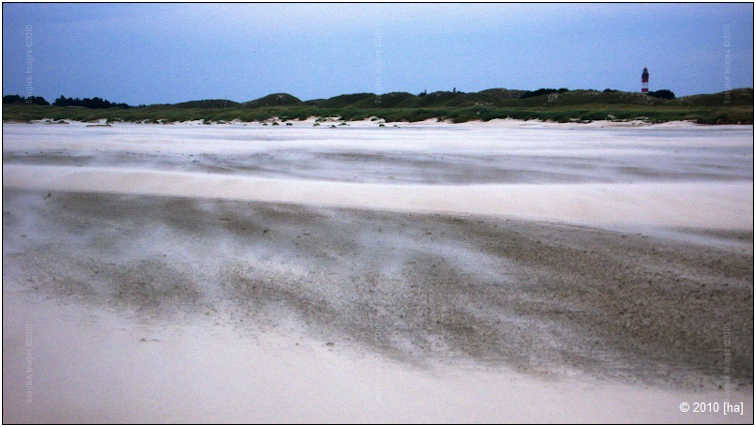
My favorite of this series, an almost surreal view of the island of Amrum. I hesitated to take my camera out of its tightly closed plastic bag in what was in fact a small sandstorm but in the end I couldn’t resist. The atmosphere created by the late-afternoon light was very special.
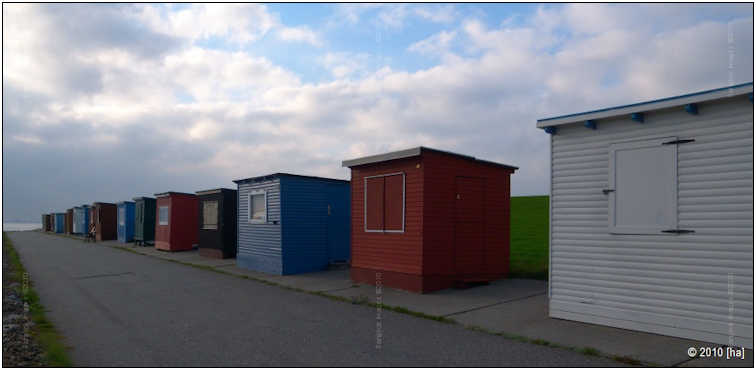
Beach cabins in similar light. A scene that reminded me very much of the works of American painter Edward Hopper. Unfortunately, I missed his exhibition in Lausanne…
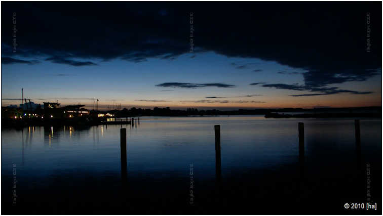
After sundown on the Saaler Bodden, seen from the port of the city of Barth.

Taken in the Museum of Maritime Research in Stralsund, at ISO1600. It clearly shows the limits of a five-year-old compact when it comes to available light photography. Still I liked the scene and tried to find a good way between too much noise and too little detail when processing it. The lighting really was that blue.
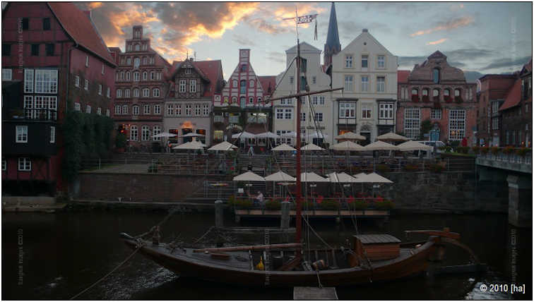
An HDR composed of 5 individual pictures, shows the old port of the city of Lüneburg – and another technical problem: While the camera was stable on the tiny tripod I carry, part of the subject moved… With a lot of masking effort, of course, this could be remedied, but as you know, post-processing is still not among my favorite pastimes…
To conclude, shows the small city of Northeim, known for its half-timbered houses, in the last light of the day. This one could have profited from HDR processing, too (in reality, the sky was much more dramatic), but I didn’t find a suitable place for my tripod (it’s just 10cm high, so I always need a support for it). When searching for it, I almost missed the moment when the sun's last rays were reflected in the houses' windows… The result was the best that I could do based on a single RAW.
That’s it for now. Hope everything is fine with you and your family. Best regards,
Tom
Tom –
Very nice! Thank you for the submission. I especially like the image with the bridge in the fields.
Steve
I suspect the readers submissions will be a highly anticipated section of this column and I encourage anyone with photographs and travel accounts they'd like to share to please send them to me at: info@BangkokImages.com
Readers Questions *menu
Steve.
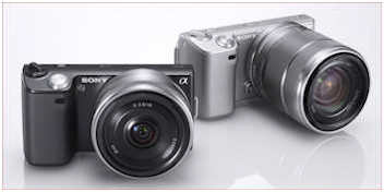
Here are a few observations and comments on my first 7 days with the Sony NEX-5.
It is a good solid camera with easily assessable controls and menu items. Reading through the instruction manual is easy and helps considerably with understanding the many and various functions on the NEX-5.
It will take some practice to make adjustments on the fly when facing various shooting possibilities.
The 16 mm lens makes the camera a decent “pocket fit” and that is a plus for me when just moving around town or at a restaurant. The lens is good and seems to give clear pictures when I set my priorities correctly. The “zoom”
feature with the 16 mm lens is a surprise and does provide adequate pictures in a pinch.
The video camera feature is good but the on/off button is a bit difficult to use when holding the camera in a firm non-shake position. The picture quality is fine in the AVCHD shooting mode.
I re-read your column dated July 31, 2010 with the review of the NEX-5 during the trip to Pattaya with your son and it has provided some good information. The use of the 16 mm lens on this trip was very helpful in how it performs in that environment,
The HDR feature on the camera does make a difference on most night scenes and really enhances the picture quality by combing three exposures into one shot. I have not tried the DRO option yet to compare it with the HDR feature. Question is why not use
HDR on all night and day pictures for best results when just shooting scenery.
The one area where I am still not getting good results is with outdoor scenes that contain a lot of green plants, bushes, lawns and trees. The greens are not that vibrant and generally not in good focus. I am using the Program Auto and Intelligent Auto
shoot modes most of the time and perhaps I need to experiment more. The “depth of field” in some shots has been clear in the foreground but blurry in the background or visa-versa. People pictures taken outdoors are good and clear
but the backgrounds are blurry. The defocus – clear feature is still a bit confusing and a challenge. I am working on correcting this by reading the manual and taking lots of pictures.
The use of the 3-inch variable-screen that moves up 80 degrees and down 45 is really a good feature on this camera for taking waist level pictures of interesting subjects.
I guess all the years with point and shoot cameras has made me a bit lazy considering my last SLR was a Nikon Nikkormat 35 mm that I used underwater.
Rickster
Hi Rick –
More great feedback! Thank you. Others have been asking if others have reported positively on this, and now I can post something from a ‘non-pro’ which seems so important to everyone.
The greens.. What firmware do you have installed? I already told you a new one is coming out this week? One before it took care of some other issues. And if a certain color isn’t looking right, then consider adjusting the white balance. Make sure it’s either on auto white balance, and if that isn’t working for you then try a warmer setting. If you’re shooting raw you can just adjust later. There have been people reporting “muddy greens” on the first samples, but the first firmware revision took care of most of that.
You do know the ‘zoom’ feature is nothing more than a digital zoom which you can do a better job of by simply cropping the image later?
I agree with you about the HDR, but hope that in a future firmware revision they allow HDR and the sweep panos in raw and not limit them to jpegs like they do now.
About your question on HDR. HDR requires you hold very still and not move the camera between shots, and that nothing in the frame moves between shots including clouds, cars, people, waves in the ocean, or any dynamic part of the frame. This isn’t always possible. Then there’s the issue of taking more time to make the capture so you lose frame rate speed which might be important with some shoots, and of course being limited to jpegs isn’t much fun and strips away a great reason to shoot this camera with its nice big sensor in the first place. Plus, while HDR can be done in camera and this is a great feature when in tourist mode, you’ll get much better HDR’s by simply bracketing your shots and performing HDR later during post-processing.
The people being clear and the background defocused is a huge benefit of a larger sensor. You should notice as your focal length increases, your aperture increases (gets bigger, but the number gets smaller i.e.. F2.8 vs. F11), and your focal distance decreases, then you’ll get more of a defocused background. If you want more depth of field, simply reverse the above. Reading the manual is a good start, but most manuals will leave the reader at least a bit confused. Take a look at some of my DOF articles here,here, and here. Oh, and here too.. ;o)
I agree the articulating LCD is a great feature and lets you get in position for perspectives you wouldn’t get without it, or without laying in the street. A great way to get more interesting photos!
I suspect you’ll get a lot more out of the camera as you learn it’s functions and ask questions. Don’t forget to send in some examples to share with us.
Take care
Steve
Please submit your questions to info@BangkokImages.com All questions will be answered and most will show up in the weekly column.
A Snapshot of Bangkok Images Week in Review *menu
![]()
This week there was only one workshop, more work on the website, but not as much progress as I would have liked. Hopefully we'll have accomplished more by next week. We've received our new Logitech K800 keyboard and Garmin Nuvi 3790T GPS and have spend some time reviewing both. I hope to bring you both reviews soon.
The “What’s New” area of our site continues to grow in popularity and the numbers are growing every week. The forums could use more activity, so if you want to meet other like minded photographers or just ask a question check them out. We’ve been updating the What’s New page several times a week and provide either an interesting new image or something of interest. Check it out to keep track of Bangkok Images exploits and commentary throughout the week.
ove of Work
Infocus Blog, For The Love of Work *menu
I love what I do. But then, I’ve always made it a point to love what I do because I learned a lesson early in life and I’ll share it with you. Not knowing better and having been told by my parents that there was no money for college and I wasn’t college material anyway, I signed up for my high-school's “Vocational Automotive” program which ran for 3 years, 3 hours each morning, and at completion we took our ASE tests and became very young but qualified mechanics. I figured this would be a great job because at 16 I loved working on my own cars. What better way to make a living right?
I didn’t know it then, but what I really loved was working with people. From age 11 I worked full time in a seafood restaurant on the Santa Monica pier. The restaurant was owned by my best friend's parents and I had a blast working for my best friend at one of the more fun places in town. But at slightly above minimum wage I knew it wasn’t going to be my career. Now I knew being a mechanic was going to be my career!
After graduating from the vocational program and earning my ASE certification in all seven areas (there are eight now) I went to work for the local Datsun dealership and because of my racing background and good work ethic I was soon the lead mechanic for their 240z and 260z performance department. I was the guy installing performance engine, suspension, and other parts to make your Z go fast. I did this for almost a year and was making 5 times minimum wage per flat rate hour. I averaged 2.5 flat rate hours per real hour, so I was making roughly 12-13x what I made at the restaurant. And I hated it.
I hated it with a passion and it took me going back to my previous job to learn why. I learned that cooking for and interacting with my customers while providing a service is what was really making me happy. I enjoyed working there as my primary job until entering the military. My position in the military and subsequent careers have all been positions working with people either in a service, leadership or teaching role. I’ve been happy since. Because I learned what I really enjoyed, I’ve been able to progress far beyond being a cook or mechanic.
That was a long run-up to what I really wanted to talk about, but sometimes that’s necessary. Or maybe I just enjoy hearing myself talk.. J Today I was discussing ‘loving your job’ with a Thai friend and I mentioned to her that I’ve rarely seen a Thai who appeared to love their job. Subsequently this means that most Thais I know are just going through the minimum necessary motions to earn a paycheck. However, without love for the job/career, there is very little competence or a high level of service to the customer.
If you don’t love your job, and you live in a country where mediocrity is the norm, what motivation do you have to be better at your job than anyone else? Not much. You’re not going to spend much time with continuing education, reading trade magazines, research projects, trade shows, or any of the standard things we do in the west to give ourselves a competitive edge.
My Thai friend agreed with me. Most Thais don’t love their jobs and in fact weren’t very good at their jobs. I surmised they didn’t love their jobs because they weren’t being motivated by their employers to learn more, serve the customer well, and the financial rewards just weren’t there. She disagreed. It was far more.
She went on to tell me about the Thai educational system. Basically it boils down to this: The students who do the best on tests qualify for the highest paid positions like doctors and engineers. Students who don’t do as well on the tests have zero chance to be a doctor or engineer. And if you do well enough to be a doctor or engineer, then your parents who are footing the bills for your school won’t let you do anything else. Thai culture dictates higher paid positions earn more money, hence more respect, which essentially equates to being in a higher “class”, so you don’t turn down such opportunity. Even if you hate it. Even if because you hate it you’ll probably won’t bother to be any good at it. You’ll do just enough to qualify and just enough to earn a paycheck.
In the west, if you’re starting college and you don’t yet know what you want to major in, then fine. Your first two years or so can be filled with general education requirements essentially giving you two more years to make this important decision. And, if you’re a year into your major and you decide to transfer to another major, you get to take your general education classes and perhaps some of your other classes with you into the new program. You won’t need to start from the beginning.
The Thai system doesn’t allow this. You not only have to declare a major to enter a program, but you need to have the test scores to enter the program. And your scores determine to a very large degree which degree major you’ll be studying, whether you want to or not. And.. if you find you really hate the program and decide to quit and start another program, you cannot take any of your class credits with you. You start over again from the beginning. This probably won’t be a popular choice with the person paying the bills.
It didn’t take much asking around to learn its much the same throughout most of Asia. Really, this wasn’t new information to me. I’ve lived in Asia long enough to have observed all of this many times. What was new to me was that I’d never thought about how this affects someone loving their work, and as a result how well they do their work.
Would you want a doctor who only because a doctor because he/she scored high on their college entrance exams and was basically told they were going to be a doctor? Do you think they’d love their job enough to strive to do better at it, maybe become the best? To spend a lot of their personal time furthering their knowledge? To join professional organizations? Or do you think they’d do just the bare minimum to get by at work, draw their paycheck, and not get in trouble? Which of course means doing their best to avoid responsibility and anything which may be regarded as risky? Or substitute “doctor” for “engineer who builds tall office buildings.”
Is there a solution? I think so. I think it’s the same solution that would fix most of Thailand’s social and economic issues.
- Stamp out corruption at every level of government and society.
- Become a genuine democracy.
- Open the markets.
The first two would be necessary to achieve the last. Opening the markets, or in other words letting in foreign businesses, products, imports, without undue or unfair taxation or duty, basically adopt free trade agreements with the major western nations and whoever else will agree, and prosperity will come to Thailand in a huge way.
Consumers can suddenly afford much more, more jobs will be created to serve the consumers, and competition will drive education and motivate instead of test scores and class structure. The more jobs, the higher the pay, the better the pay the more spending takes place, more spending means even more jobs. We call it economic growth. Real economic growth. Growth for everybody and not just the rich and elite who currently control the government and subsequently every market to benefit themselves. 7-8% economic growth sounds great on the surface. Until you realize that 7-8% growth is only happening to the 1-2% of the population and it’s this 1-2% of the population who controls the government and economy.
With real and fair income and property taxation Thailand could afford vast infrastructure improvements, much better schools with better trained and higher paid teachers, and they could afford to let their young students attempt their dreams no matter what they may be. Which means we’ll herald in a generation who finally loves their jobs.
Of course not everybody will reap benefits. But more will. At the present only 1-2% of the countries rich and elite are reaping the benefits. Stamp out corruption and open the economy and within a decade well over 50-60% of Thailand’s citizens will be reaping the benefits. You want proof? Look at Singapore, keep an eye on Vietnam, study S. Korea, visit Taiwan. Study the countries which have really changed. They all started by stamping out corruption and opening the markets.
Other countries have passed Thailand by, and Thailand just watches as it remains the third world country it always has been. It’s definitely a chicken/egg thing. But it wouldn’t take as much as most think to start a chain reaction of Thai citizens finding interest in improvement from many different directions. Dealing with corruption would be the proper start.
Until next time..
![]()