Ayutthaya Wat Ratchaburana/Hoya Pro1 Digital Filter Series, A Review
![]()
|
• Sritara Hotel • Star Hotel • Suriwongse Hotel • Tao Garden Wellness Retreat |
I have some unfortunate news to report on this project and total 100% transparency is how I feel this should be handled. My planned beneficiaries of this project, innocent very much in need children at a certain orphanage, have fallen victim to their local manager who we have found cannot currently be trusted and I doubt this is likely to change. Decisions need to be made if we're going to carry this project forward and if so who the new beneficiaries will be. I do expect this project to generate significant revenue so I take it very seriously. As you read this I'll be back in the Mae Sot area investigating further. I'll keep you informed. For now I'll still collect images with the intention of making the best most meaningful mosaics possible and as always, I'm asking for and will greatly appreciate your help with the images.
We are still accepting (and pleading for) images of children from SEA. No matter how terrible you think
they are, please send them in anyway. These images will be used to complete a set of 3 high quality mosaics which will be sold to benefit the Karen and Burmese Orphans living in the orphanages and refugee camps. The more images the better, I can
use all you have. Please take the time to go through your images for anything you think might help. If you missed the "No Place to Call Home" special, you can
click on the link and read more about this. Thank you! info@BangkokImages.com
Quick Click Links
Feature Photograph
Ayutthaya, Wat Ratchaburna Hoya Pro1 Digital Filter Series, A Review

Photography News of Interest
Readers Submissions
Readers Questions A Snapshot of Bangkok Images Week in Review
Infocus Blog, Why We Do..T

Feature Photograph *menu
Today was quite the enjoyable day to the new Ayuttaya Floating Market which appears to be built by Thais for Thais, very "storybook" and still under construction on many levels. Accompanied by a good friend
we were trying each others lenses and equipment and the subject of perspective came up and I submit the following image as an example of using a 12-24mm rectangular lens on a full frame body.
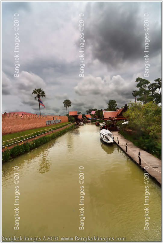
Canon 5d Mark II, Sigma 12-24mm F4 @F11 1/320th 15mm ISO 100
What do you see? From a 15mm perspective the scene leads you down a green water klong lined by a fence and grass with 'something' at the end. Only with a 24×30 inch print could we see the attractions at the far end of the composition.
During our outing we talked about the important of cropping and processing, even including sharpening, for each individual size print to get the most out of our compositions. What more could we get out of this image?
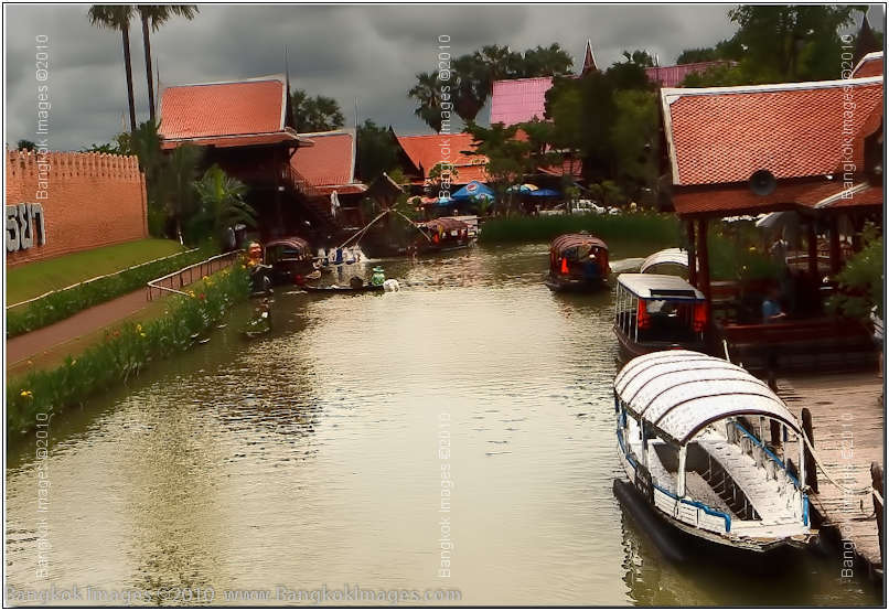
Canon 5d Mark II, Sigma 12-24mm F4 @F11 1/320th 15mm ISO 100
It's almost shocking, and certainly significant to realize that by cropping the very image above, we have know created a much different composition with totally different compositional elements. Which do you prefer? Where would you crop this image
and what size would you make the print to hang on your wall? Another individual choice, a choice we make each time we compose an image in our minds eye, and sometimes later once we've had a chance to reflect and perhaps change that image.
It's also important to note that if we train ourselves to know these perspective differences are a choice of every composition, then we wouldn't try and make a great print from a crop of a 15mm image. Instead, we'd take our 15mm capture,
change to say a 70-200mm F2.8L IS lens and make a much better image.lden rule to recite, its only significance is to understand such differences exist in most every image we process and that we as photographers hold the artistic control in our
hands. Can a crop define a composition? Certainly. Can a crop define an artist? Perhaps.
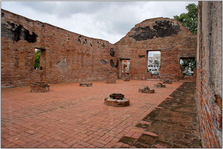
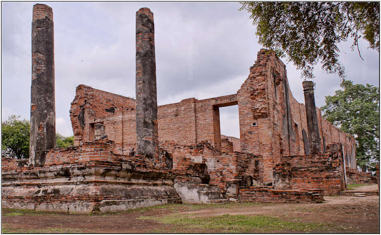
Ayutthaya, Wat Ratchaburana *menu
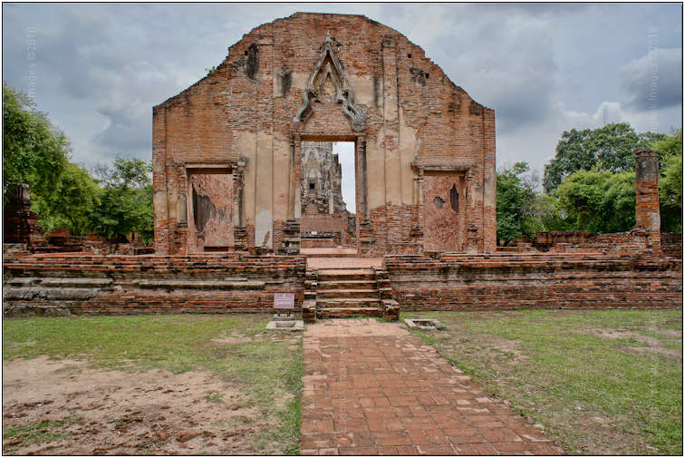
Sony NEX-5, 16mm F2.8 @F5.6 ISO 200
This week I got together with Stick and we headed out to Ayutthaya looking forward to checking out Ayutthaya’s new floating market. After a bit of looking we found the new floating market, still very much under construction, and after an hour or
so walking around taking photos we both agreed it was built by Thais for Thais. I’ll explain what I mean by this statement in a later column, or perhaps Stick will get to it first, but soon we went looking for better photographic opportunities
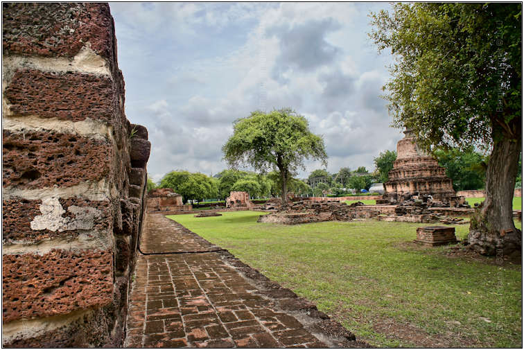
in the area. I’d often take workshop students to Wat Ratchaburana so I suggested we stop by and give it a look.
Unfortunately Stick and I don’t find the time to get together as often as we’d like, so of course we wanted to make the best of things. We’d already felt like we'd struck out at the new floating market so recommending Wat Ratchaburana
was a bit risky. Stick kept worrying about getting caught out in the rain and every time he mentioned it I smiled because as you know I love being out in the weather. No better photo opportunities occur in nature than from inclement weather. Looking
at the dark cloudy skies I solidified my position to visit Wat Ratchaburana and off we went.
Sony NEX-5, 16mm F2.8 @F5.6 ISO 200
You’re probably asking why I feel this place is risky? The explanation is a bit complicated. I often take workshop students to this location because it’s quiet and we can hear ourselves think, we can practice landscapes of old temples (important for those soon to be heading off to Angkor Vat),
and there are many angles and different perspectives which makes the place ideal for teaching a beginner certain techniques, and more advanced students more advanced techniques. Instructionally this location has a lot to offer.
Artistically it’s one of the local challenges which still frustrates me. And there lays the conundrum. In over 50 trips to this one location I don’t feel I’ve collected enough ‘good’ photographs to even
make a small gallery for my website. The place isn’t visually appealing being mostly ruins, the grounds aren’t especially well kept so we’re offered really muddy colors of old style brick, marginally green grass, and lots
of dirt. Even the trees are lackluster. Put it all together and you don’t have much to make a visually appealing image. I know this sounds defeatist and you know I love a challenge, so why the attitude? I dunno.. but I just can’t
get that excited about the place. Until today.
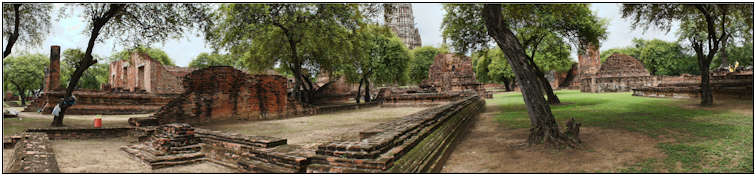
Sony NEX-5, 16mm F2.8 @F6.3 ISO 200 Sweep Panoramic Mode
Today as Stick kept pointing out the weather looked like rain. Dark clouds were forming, the odd raindrop was falling, and even the wind was picking up a bit. If ever I was going to make interesting images at Wat Ratchaburna this was the day!
To make things even more interesting I’d brought along my new Sony NEX-5 pocket camera with its DSLR sized APC-S sensor and its new 16mm F2.8 lens and if I didn’t know better I’d swear Stick was teasing me to try and do as well as
him while he was using his much superior (and expensive) Canon 5d Mark II DSLR, so leaving my own Canon 5d Mark II in the truck I grabbed the little Sony NEX-5 and headed out.. but not before securing my handicap with Stick. I
knew he’d been wanting to try my Sigma 12 – 24 mm F4 lens which is a very difficult lens to use without specific instruction so I offered it up and he accepted. Handicap secured!
Sony NEX-5, 16mm F2.8 @F5.6 ISO 200 Sweep Panoramic Mode
Probably the majority of my very best landscapes were made with the Sigma 12-24mm F4 lens so it is indeed a very capable lens, but the first time you look through the viewfinder of your full frame DSLR at a 12mm rectangular view you feel a bit lost and
you’re not sure what to do. In contrast my 16mm F2.8 lens on an APC-S sensor Sony NEX-5 was providing me a fixed 24mm (35mm equiv).
Looking at the Canon 5d Mark II and the Sony NEX-5 side by side reveals a night and day difference in both size and weight, not to mention style and user interface concept. The Canon is a very traditional DSLR, the Sony a brand new concept in consumer
orientated point and shoots with a DSLR sized sensor for better image quality. Either way you look at it, I knew which one I’d rather carry around all day. To make matters even more interesting I was going to shoot in straight jpeg mode
just like most beginners and/or users of point and shoot cameras would be using. Enough chatter, let’s take a look at the results!
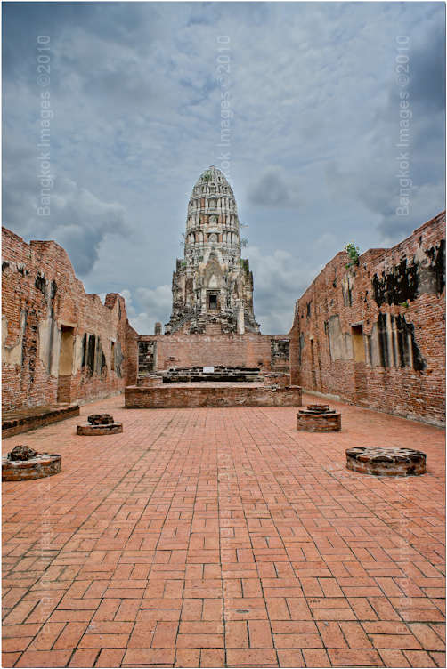
Sony NEX-5, 16mm F2.8 @F5.6 ISO 200
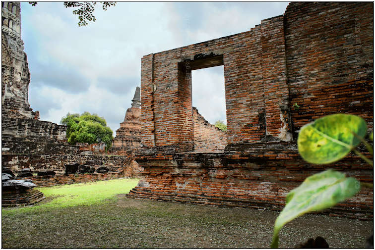
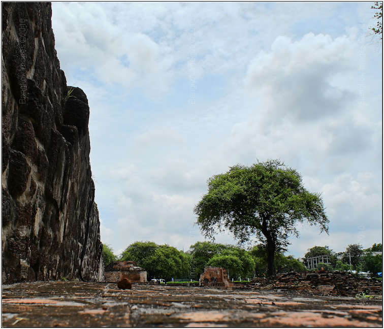
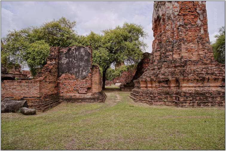
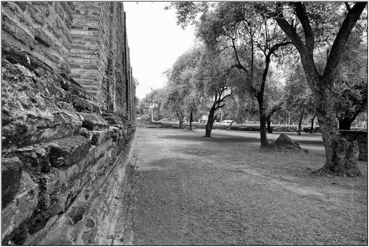
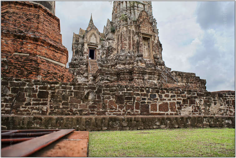
This is one of my favorite views A tall chedji (thank you Stick for telling me the Thai name for the things) in the background framed by clay brick walls with perfectly aligned clay bricks leading from the corners of the foreground to
the end of the background. Usually the sky is a hot washed out white color, or a faded blue at best. Today we had storm clouds. What a difference a cloud makes! Can you see why I favor inclement weather?
Sony NEX-5, 16mm F2.8 @F8 ISO 200
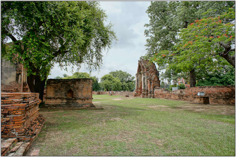
When using a wide angle there are three visual components to try and include, a foreground (the green leaves), a mid-ground (first structure), and a background
(furthest chedji and brick wall). Having all three lends scale and helps make the image more visually appealing. In this case we had a nice streak of sunlight lighting the mid to back ground areas for further
scale and visual appeal, and of course the nice clouds.
Sony NEX-5, 16mm F2.8 @F8 ISO 200
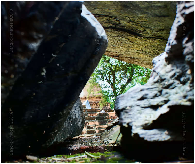
I’m pretty sure Stick didn’t take me seriously when I told him to try and capture a shot of this ‘cavernous’ rock formation, but by balancing the exposure of the inside of the
formation and the view of the trees and chedji outside the formation, I ended up with a somewhat interesting shot. Stick didn’t take me seriously because to him it just looked like a big pile of rocks, and it was. He probably thought I
was nuts sticking my little Sony down in that hole and for wasting his time trying to get him to look at it.. ;o)
Sony NEX-5, 16mm F2.8 @F5.6 ISO 200
Did you know Stick is shy and doesn’t like having his picture taken? Me either. I think most photographers share this trait. In at least HALF of the images I used in this piece Stick was in the original image. He just kept walking into the scene
and getting in the way, so I just kept shooting like he wasn’t there. Then later I made him disappear. He was standing to the right of this tree exactly between the tree and the fence. Can you tell? Thank you Adobe CS5 and Content Aware
Fill!
Sony NEX-5, 16mm F2.8 @F5.6 ISO 200
Remember I said there were interesting lines and structures? With a point and shoot camera you can lay it right against the wall and then use the LCD to frame your composition. Stick is standing right between the closest tree and the building.
Sony NEX-5, 16mm F2.8 @F5.6 ISO 200
24mm (35mm equiv) is a very popular focal length for landscape photographers. You’re able to get a wide view while keeping the perspective distortion in check. Notice the two tall supports? By using the camera properly, keeping
the lens perpendicular to the subject, and perhaps just a wee bit of Photoshop we can keep them nice and straight.
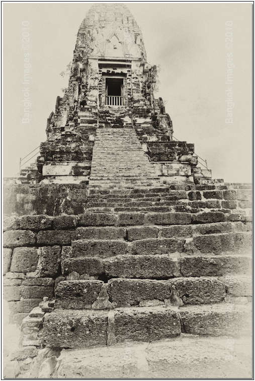
Sony NEX-5, 16mm F2.8 @F11 ISO 200
Sometimes an image just offers you very little as in the case of this image. The clouds weren’t even there, just a blank hot white sky and some dirty bricks being used as stairs. By laying the Sony NEX-5 on the step, on its side, and stopping the
lens down, I was able to get a nice deep depth of field (DOF) with everything in focus from the closest step to the top doorframe above. Then using a split toning technique I aged the image and to me made it more visually appealing
through processing.
Sony NEX-5, 16mm F2.8 @F5.6 ISO 200
This truly is a terrible image but I wanted to share it anyway. We have a nice sky thanks to the clouds and a nice green tree as a mid-ground. What I wanted to demonstrate was that laying the camera right on the bricks surface you can create a sort of
foreground which ‘can’ be visually appealing. IF it were in focus it would be appealing and somewhat interesting because of the eye-catching detail. This was a limit of the little Sony
combination. With a full frame DSLR and the 12-25mm F4 lens you can stop it down to get enough DOF to make every element in this frame in focus.
Sony NEX-5, 16mm F2.8 @F8 ISO 200
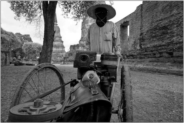
24mm also allows for an interesting perspective when used with people. I saw this one coming and walked in front of the lady and asked to take her picture. Notice the pulley and drive belt stretching from the left front and extending to the middle of
the frame? I would have been happy just with that, but the black leather satchel is what really caught my eye. Seems more than a bit out of place on a lawnmower?
Sony NEX-5, 16mm F2.8 @F8 ISO 200
Working with a prime forces you to use the old fashioned “foot zoom” and to not be lazy when framing your compositions. In this image I’m framing several structures with a walkway down their center. Notice how the
clouds really help provide nice skies?
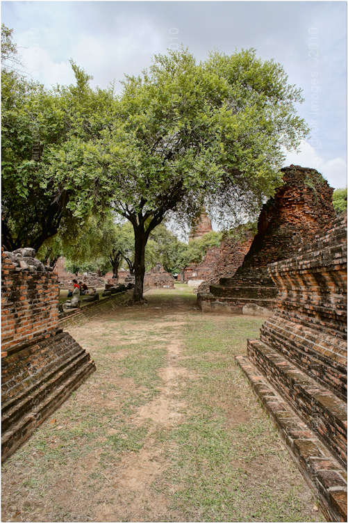
Sony NEX-5, 16mm F2.8 @F8 ISO 200
Using “foot zoom” I then moved closer and frames a shot right down the center of that same viewpoint, but this time I turned the camera into portrait mode for more effect. At 24mm the DOF can be extreme and it helps if the
closest bricks and furthers trees are all in focus.
Sony NEX-5, 16mm F2.8 @F5.6 ISO 200
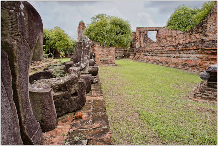
There are several places in the complex where they place statue ‘parts’ on a low fence on display. Capturing them straight on is what most every tourist does. Using a deep DOF and capturing them in an offset alignment while
including the neighboring structures and nice trees and skies is what a photographer does.
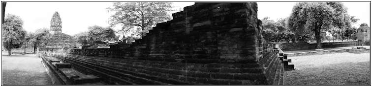
Sony NEX-5, 16mm F2.8 @F5.6 ISO 200 Sweep Panoranma
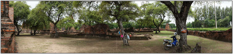
One of the advantages of the Sony NEX-5 concept is the ability to take automatic in-camera HDR’s (high dynamic range images), automatic panoramas, and even HD movies as easily as you can capture a still image. I use the panorama
feature every time I want to include more of the scene to tell the story than the lens will allow. The camera then turns out a nice 8000 pixel wide image suitable for making a 2 meter wide print for your wall. Stick was standing between the tree
and the wall on the other side of the motorbike.
Sony NEX-5, 16mm F2.8 @F8 ISO 200
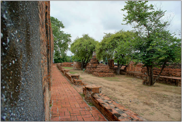
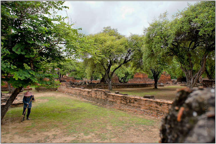
Another image taking advantage of a seemingly endless brick wall and a nice stretch of trees. There were 3 tourists and Stick on that path you can see leading down the frame. CS5 and I made them disappear.
Sony NEX-5, 16mm F2.8 @F8 ISO 200
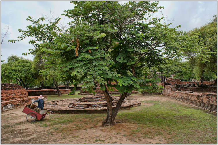
I really liked this composition. The foreground is on the left front of the frame, the mid-ground the grand tree beyond, and the background is really interesting with the arches and nice sky and tree line. The shadows and sunlit areas help add dimension
as well. Where was Stick and 2 others in this image as well. See them?
Sony NEX-5, 16mm F2.8 @F5.6 ISO 200
This is a bit sloppy in the processing, looks a bit too saturated for my tastes. Another example of using your wide angle lens to provide the three compositional elements (fore/mid/back ground) that help make an image interesting. The fine detail on the
bricks in the foreground draws the eye before it’s led down the path between the mid and back grounds.
Sony NEX-5, 16mm F2.8 @F5.6 ISO 200
This image gives the impression the place is really more beautiful than it is. Finally! I was watching Stick capture an image of that rock on the fence in the mid ground. I made him disappear in this image as well.
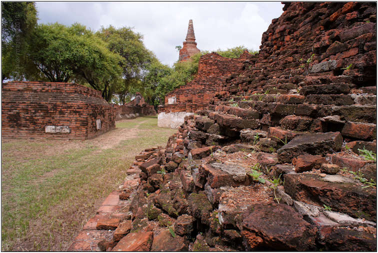
Sony NEX-5, 16mm F2.8 @F11 ISO 200
Texture is also a compositional element, and when I first noticed the texture of the bricks in the rise in the foreground I had to think about how I wanted to use them in the full composition. The texture, leading the eye down the wall as I’d done
several times before, and the trees and nice sky. Using the elements in this way, right ‘in your face’ as with the foreground, really lends depth of scale and a feel to the image you wouldn’t otherwise capture.
Removing the two tourists helped make the image a bit cleaner.
Sony NEX-5, 16mm F2.8 @F5.6 ISO 200
This image is all about texture with the huge stone fence, bricks everywhere, and the wall where I set the camera. We’re also close enough to appreciate the stair cases, door frames, spires, and more. With 14mp on hand there is more than enough
resolution to print these at 20×24 inches if desires where you can really see more than with a small internet image.
Overall a very nice walk through Wat Ratchaburana. It’s always fun shooting with a friend and comparing notes on technique and equipment, the weather lent itself nicely to our compositions, and it was fun stretching the capabilities of a $600 camera/lens
combination knowing in return you’re getting DSLR quality images.
I can’t wait to see how Stick’s images turn out, comparing the day's ‘take’ is one of the pleasures we enjoy and a great way to learn. You see, Stick’s a very good photographer with a developed
eye. I know my eye, but by studying his work and comparing it to my own, both captured during the same outing, then I get some insight into his ‘eye’ and my knowledge base is that much better for it.
A final word about cameras. We’ve all heard the old adages “it’s the craftsman and not the tools?” Sure, I agree with this to a point. The fact is, craftsman need tools or nothing gets built. What we need to
think about is the difference between tools. I was able to make these captures with a $600 body/lens combination. I’m really not sure if my images would have been better had I selected to take my Canon 5d Mark II and my 70-200mm F2.8L IS
for instance, an easy $5000 worth of gear. Certainly the Canon is capable of a higher image quality, and a better lens will provide better images, but where is your personal point of marginal returns?
By this, I mean everything we do has a point where when we continue to spend we get only a marginal benefit in return. With photography this is a sliding scale when experience is factored in, as an experienced photographer will get more out of a given
set of gear than will a beginner. What about the guy with the $50,000 medium format digital back system? Will he really get $50,000 worth of better images than I got for $600? Perhaps, now we can factor in the requirements of the job. Some jobs
demand a higher image quality, someone is willing to pay for that quality, so now it becomes a factor.
So obviously tools do matter. The trick is to decide how much they matter to you as an individual. As technology provides us more capable cameras, we can all of a sudden do more at a given price point and do it with a higher quality. A $600 camera that
provides DSLR quality still images, HDTV movies, panoramic’s, and more. 10 years ago we’d have thought this impossible.
Hoya Pro1 Digital Filter Series, A Review *menu

I’m a big advocate of protecting your gear, especially lenses with fragile elements which can easily be cracked or broken. The “protection filter or no protection filter” great debate rages on without my inflaming
the debate, so allow me to simply summarize what I do and my rational for doing so.
When I’m in a clean studio or even indoors I don’t use a filter. When I’m outside in the less than clean environment of South East Asia, beaches, rivers, basically anything where I can’t control the environment then I do use
filters. I use Hoya Spro1 ultra-thin UV filters in SEA, and Hoya Spro1 ultra-thin Skylight 1b filters in the great Northwest of America. Very subtle differences, but based on my experience I use these two filters in these two greater areas.

ALL THE TIME, 100% OF THE TIME, NO EXCEPTIONS I use protective hoods/shades. These are the hoods that come with your better lenses and are optional on your more ordinary lenses. A hood will do more for protecting your lens from bumps, drops, dirt, crud,
or anything out there.. than a filter or “trying to be careful..” A hood is cheap insurance with zero downsides. Not using a hood makes you a chump. Sorry, but that’s the way
I feel about it. I’ve seen way too many extremely expensive lenses broken which could have been prevented by using a simple hood. And then there’s the less often reason for using a hood, the blocking of stray light under occasional
circumstances. I probably wouldn’t find a hood worth it for this reason alone.
True Story: My son and I were out on a shoot a few weeks ago and I ask him to mount my Canon 70-200mm F2.8L IS lens, a replacement would cost roughly baht 88,000. He mounts the lens and then comments “you know your lens has a big crack on the front element don’t you?” Eh? No I didn’t! I pull the truck over and inspect the lens and find it’s not the lens, but the protective filter that was cracked. A clean crack from one side to the other, and further the aluminum rim of the filter was crushed
on one side.
How did it happen? As near as I can figure when using a soft bag I often reverse the hood so it fits in the bag. A bellhop or maybe even myself probably set the bag down too hard on a hard floor or car park thereby crushing the filter rim and breaking
the filter glass. If the filter wasn’t on the lens it would have at a minimum ruined my filter threads, and probably broken my front element requiring a baht 30,000+ repair. Perhaps replacement of the entire lens would have been necessary.
Without the cushioning effect of the soft aluminum rim to absorb shock, a lot of damage could have happened. And yes, I’ll be very careful in the future when using soft bags.

The next day I’m down at my favorite camera shop in Bangkok buying a replacement filter. The salesman asked me if I wanted to see one of their new Hoya Pro1 Digital Filters. I did, but more I wanted to borrow his laptop and read about it myself
at the Hoya site.
These filters are made for protection, retains the soft aluminum rim, are multicoated to resist flare and increase contrast, and better yet, add absolutely no change in color as a UV or Skylight filter would. They appear to have taken the best features
of the UV/Skylight filters, and packaged them in an improved design.

I bought two! Locally they were baht 1200 each which is half the stateside price which surprised me. I mounted both on two of my most used lenses and over the course of the next few weeks thoroughly tested them. I even changed back and forth between UV,
Skylight, Digital Pro, no filter, to see if one was more prone to induce flare or other issues. There were none.
The Pro1 Digital Filter performed just as good if not better in all areas of importance than the UV and Skylight filters I traditionally used.
This was during the period I was using the Xrite Color Checker Passport
and what I did notice was absolutely no change in color values and a slightly easier to color profile white balance and camera profile. The differences were extremely subtle, but noticeable.
In the coming months I’ll be replacing all my “protective” UV and Skylight filters with new Hoya Pro1 Digital Filters. I like the idea of no color changes, zero light attenuation, and
the same great protective features I’ve always enjoyed. And the price is very good. The quality is good enough where I’ve noticed no performance degradation of even my very best lenses in the most demanding circumstances. A great
filter!
Photography News of Interest *menu
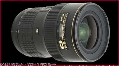
The new Nikkor AF-S 16-35mm 1:4G ED VR lens reviewed here
at Digital Photography Review is an impressive wide angle zoom. Considering its size, weight, and apparent image quality this would easily be my choice as a travel wide angle zoom leaving behind the awesome Nikkor 14-24mm F2.8 for more specialized
work. Review here.
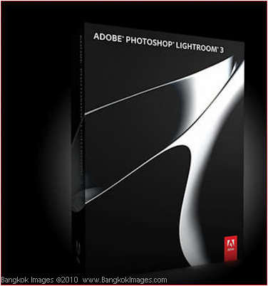
A few weeks back I posted my own limited review
of Adobe’s Lightroom 3.0 focusing on its improvements rather than reviewing the entire package. This week Digital Photography Review released their review of Lightroom 3, and if you’re still not using LR3 you’ll want to read this review. It’s a great tool with a outstanding value.
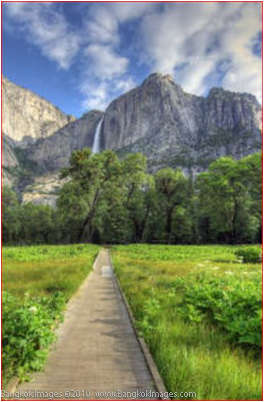
I enjoyed this piece from a non-photography site titled “10 Nature Photography Lessons: Yosemite: Wonders Unfold”,
informative and fun. Worth the read.
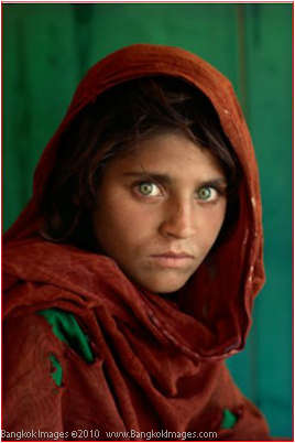
All good things must come to an end, and there could be no more fitting end to Kodak’s Kodachrome slide film than giving the very last roll produced to photographer
Steve McCurry who shot the riveting image of the Afghan girl featured on National Geographic’s cover in 1984. You’ll really want to read this article. They finally took our Kodachrome away..
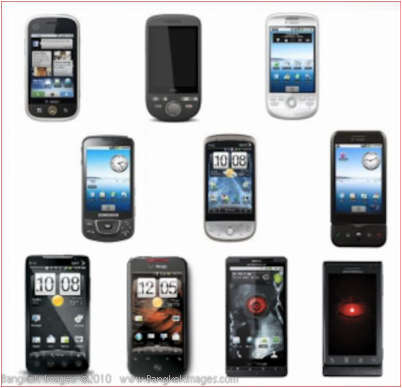
Just a few weeksback I did a review on HTC’s new Desire Smartphone and during the review I mentioned I thought Android would quickly eclipse
the IPhone and Blackberry as the most used smartphone system. According to Daily Tech Review
I was more right than I realized. Android is our new market leader. I hope they continue along their current path and don’t let us down as the IPhone and Blackberry have.
Penguin Poo from Space.
Yup, what better use to put the most advanced photographic gear to use doing, counting penguin poos. Seriously.

Readers Submissions *menu
Steve,
Some images from the Singapore shoot.
Bart
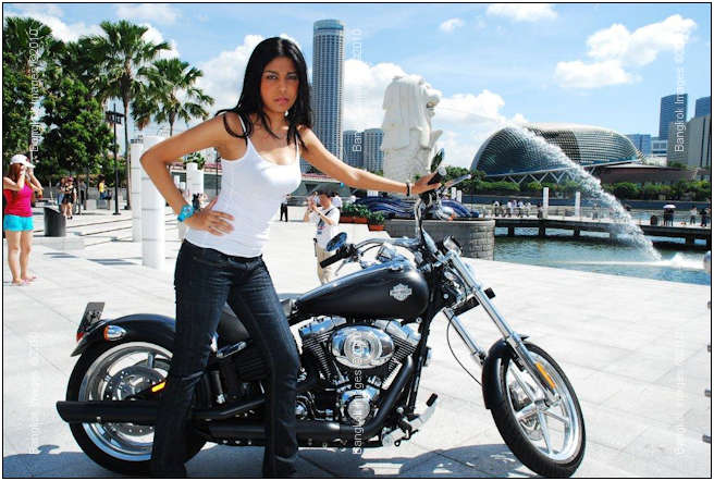
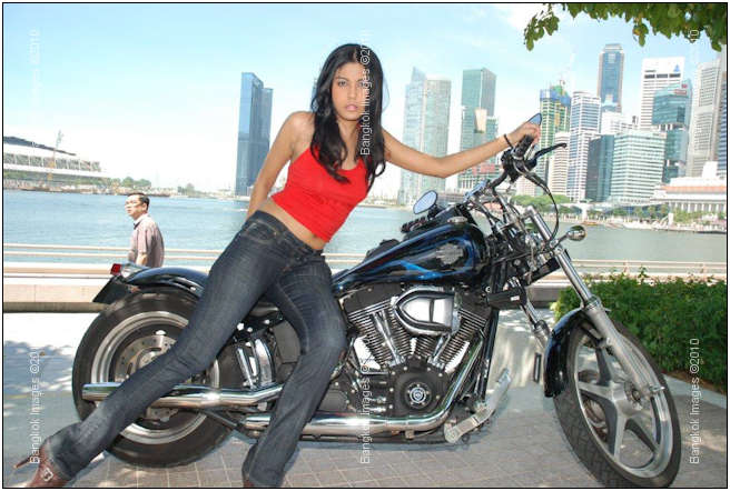
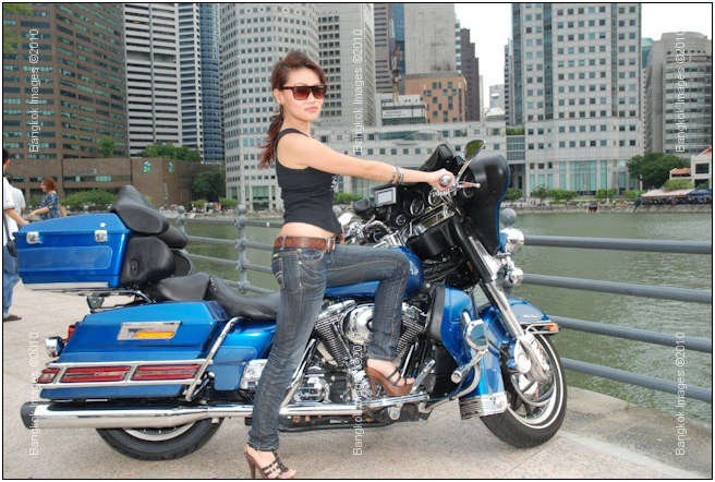
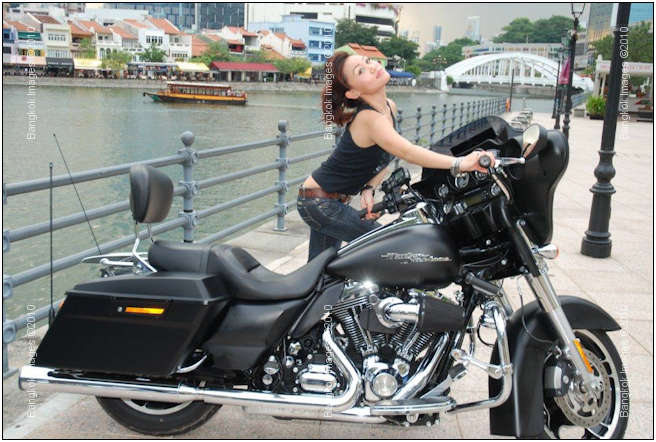
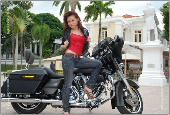
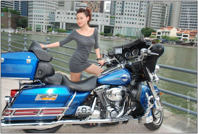
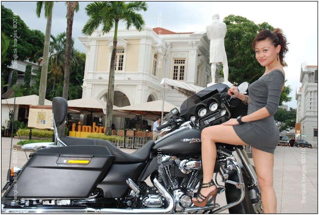
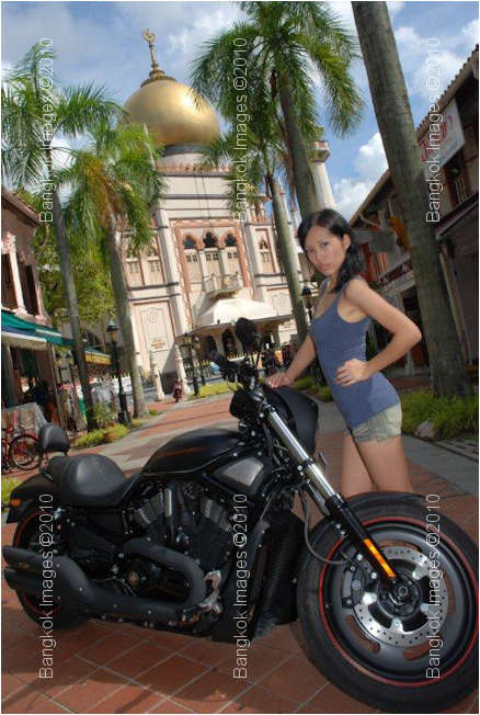
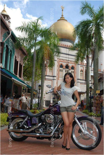
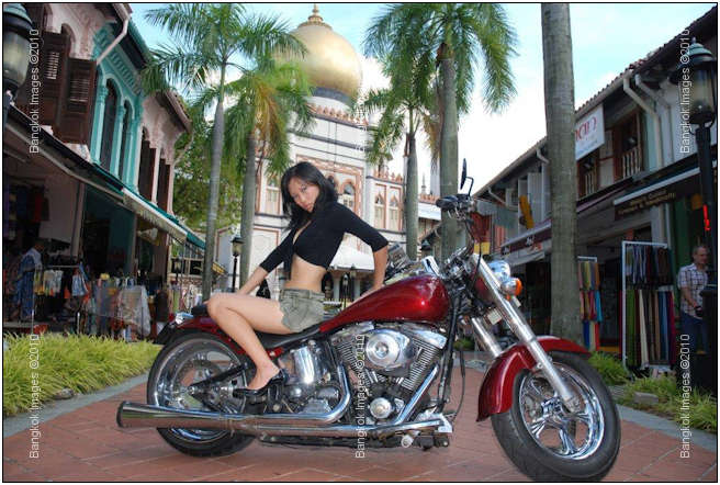
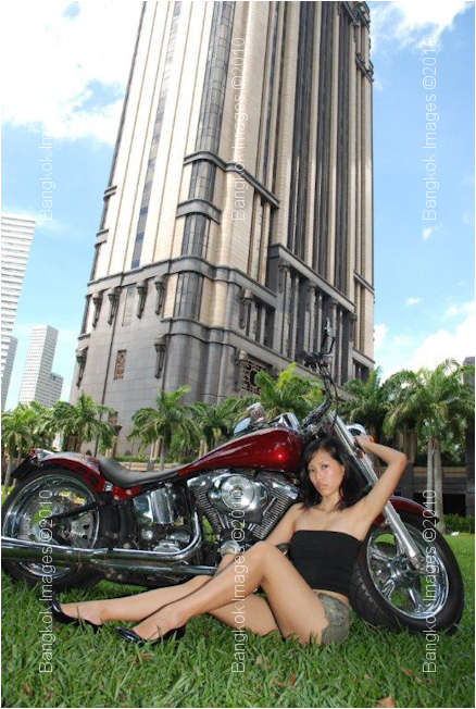
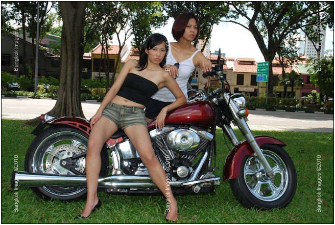
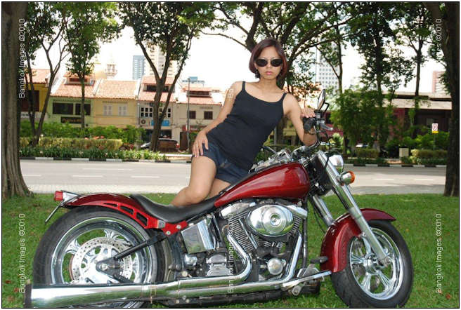
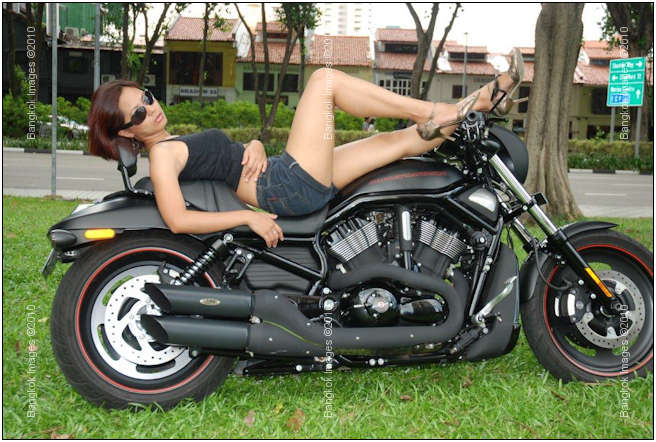
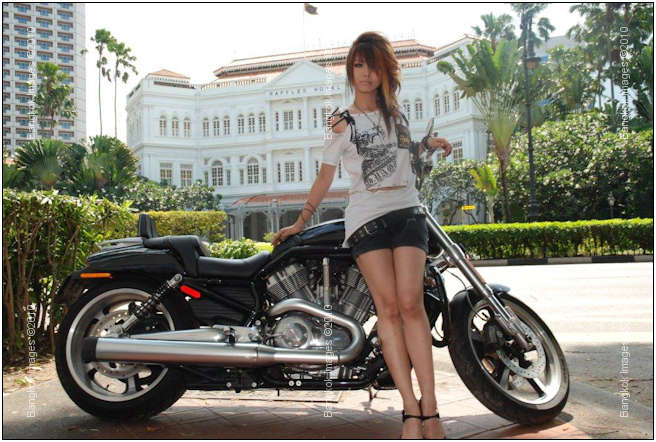
Bart –
Again, fun images! Thank you. Without your generous contributions there would be many weeks without anything to put in this section of the weekly, yet I’m sure most never tire of pretty women and great bikes!
Steve
I suspect the readers submissions will be a highly anticipated section of this column and I encourage anyone with photographs and travel accounts theyd like to share to please send them to me at: info@BangkokImages.com
Readers Questions *menu
I am in the process of buying a Samsung 46 LCD for TV and to show jpeg images. I am wondering where/how can I get a calibration done to get sRGB colors on the Samsung 6 series LCD TV.
Any ideas?
Thanks.
I have a 2010 series 8.. there are a few ways to do this and all depend on the input used.
If you're using an HDMI input and running a blue-ray or DVD.. then Spider makes a television calibrator that helps balance your colors for television viewing. I have this and it does indeed make a difference.
If you're using an HDMI input via your PC.. and I've done this via a ATI 5770, 5970, and currently a 5450 card with native HDMI.. you just can't use a regular profiling puck and software.. at least not successfully and at least not any
of the three that I have (NEC wide-gamut puck, Xrite 1id2, Spider Pro).
My experience shows these panels are not designed to be a computer monitor, so sRGB is not a consideration in their design. In fact, their gamut appears to be much smaller. Also keep in mind that a 50" 1920x1080p monitor vs. say a NEC LCD2690uxi2
imaging monitor at 1920×1200.. then the pixels on the 50" are way bigger and it really shows making text hard to read.
With all that said.. I love using my 50" Series 8 for several uses. It's great for tethered shooting, models love looking to the big monitor just to see their pose and expression and it helps them to see each image as it happens. In this case
exact color doesn't really matter.
I also use it to share images with family and friends and sometimes customers I invite over to my home. They can sit on the sofa and be comfortable and if there is no harsh sunlight shining in (evening time) then they can very easily
see the screen and the image on the screen and they enjoy viewing images in this matter.. most say it beats sitting at a desk with a 26 or 30 inch monitor. But again, they're not looking at the finer details or color.. just the overall experience
of the image.
To get the colors right on my set.. I put it in movie mode.. as a starting point. Having experimented with the other modes I find movie mode is the closest to what I want (sRGB)..
Then I use the ATI Catalyst utility to adjust brightness, color saturation, contrast, and hue from there. Go to the graphics menu, then "desktops and displays" and then right click on the bottom row of displays (not the top row with identifying numbers in the center) and choose "configure." Choose color.. and then put up a test image and adjust by eye. You'll find you can get it very close.. but some color will be out no matter how close you get it. With mine it's the reds.. the
reds aren't quite right.. so once I get it the best I can there.. then I go to the TV to the "white balance" settings and tweak the reds to be as close as possible.
There is also a maintenance menu on all these sets and there are professionals out there who make a mint color calibrating television panels.. their gear is expensive… and designed for a television gamut and not a computer gamut.. so while high end
home theater owners find them a worthwhile value.. they're not much use to us.
Each input needs to be calibrated separately to the device connected to that input, be it a computer or a DVD player or a cable box.. At least on good sets. Cheaper sets won't let you individually adjust each input.
If anyone finds a software/hardware package that lets them profile their panel for sRGB I'd sure like to know.. but so far computer monitor pucks/software.. while you can get them to produce a profile.. it's unusable..
I hope this helps
Steve
Reposted from a forum who will remain nameless because they prefer it that way.. ;o)
The Question and background information:
Anyone have any advice or suggestions for high resolution monitors in BKK? I recently bought a Samsung Sync Master 2343 but it was killing my eyes, I was getting migraines, face burning up etc – moved onto my Dell Latitude 1920×1200 laptop and all the eye problems disappeared so I think it's a resolution issue…
Actually, if anyone has any advice regarding the eye issues I was having [I pretty much live in front of my monitor]….I'd be very grateful…been thinking about getting some anti-glare glasses or something but I'm not convinced it's not simply a resolution issue…
Firstly, thank you thank you! I mean, I've spoken to my ophthalmologist and whilst he's quite competent, I got the distinct impression he didn't know a great deal about CRT v LCD and hertz and refresh rates and all that [and neither do I for that matter – obv].
I'm a writer [of debatable / questionable ability] but all the same, I spent probably up to 15 hrs a day staring straight into the screen. I have some issues with focus where I have *too* much focus [if that even makes sense], and this is a problem because no matter what I try, I can't seem to do all the eye exercises recommended, the hourly breaks, hel_l I forget to put in eye-drops for 6-8 hrs at times. And I've never needed to do any of this, despite pretty much doing what I do for many years now. But – and this might be retarded – the only *variable* changed that I'm able to isolate was this new Samsung monitor with [relatively] low resolution.
I've always had super high res screens on my laptops and widescreens at home. And literally a day or two after I thought to myself it could be this new Samsung low res monitor – and swapped over to my old laptop [15.4" UltraSharp WUXGA (1920×1200) Display with Wide Viewing Angle] that a month or two of excruciating and worsening eye soreness / burning almost disappeared.
So I'm thinking – and please tell me if this is illogical – that if I get a Dell UltraSharp 27" with 2560×1440 resolution, I'll be laughing? For what it's worth my last two monitors [which I never had eye problems with] were a Samsung T216 1900×1200 22" and a ViewSonic 24" 1900×1200 I think.
It's got to be this Sync Master 2343 with low res right?
If you're wondering why I don't just stick with the laptop, it's because the screen is too small and I find myself bending forward in very unergonomic positioning for long periods of time – and I *know* that will end up badly sooner or later.
In terms of what my uses are: I really just need crystal clear definition I think – I don't watch TV or DVDs with it, mostly just endless writing and reading small text. For 15 hrs a day. On programs like mostly Chrome with Google Docs and Office I guess – lots of forums, um yea that's pretty much my 'requirements' for it….
Eye strain is my main concern – so things like refresh rate and video cards I need to learn about. I think I have all the latest specs in terms of video drivers and whatnot, but refresh rate is 60 hertz max on the Samsung – does that even make sense? lolz – I remember reading online that it should be 80 or higher?
Thanks again – you're an eye-saver!
The Response
S –
We should start out with the caveat that 'your' answer could be one or several different things, and that on-line like this we're doing a lot of guessing and supposing. With that said I've carefully read what you've
written and given it some thought and I find several areas of what you've given me supporting information pointing towards the same areas. First, let me start out with some general information to set the background:
I also spend a fair amount of time in front of a computer screen, perhaps not as many as you, but with imaging we're looking at very fine details, differences in shades of colors, and subtle nuances that in the end can really strain the eye. I'd
guess 4 hours spent doing serious imaging work equals 8 hours of general writing..
The most important thing for imaging professionals for both accuracy of their work and eye comfort is to set up a viewing area that places the user at an optimum distance from the screen so they can see the entire screen without eye strain, and without
turning the neck. By eye movement only you should be able to easily view your entire display area. This remains the same for a dual monitor setup. The viewing area (work area) should ideally always be the same brightness, and
ideally in a slightly dim room with no bright (read sunlight or bright interior lights) competing with your eyes against the display panel. So, a set and repeatable distance from the screen where eye movement only covers the entire display,
a slightly dim room, and the monitor being the brightest light source in the room…
The current trend for monitors is the "glossy" high contrast look, similar to HDTV, because computer users overwhelmingly are playing games and viewing different types of media more than they're doing imaging or writing..
so most monitors have the "HDTV Look", and by that I mean a glossy highly reflective screen with a very bright very high contrast unit. People tend to think that because they're bigger and brighter and higher contrast..
then the "dim room" requirement is no longer necessary because now they can see the screen in brighter light.. even outdoors.. and they can. But think of how powerful the light levels are as they hit your eyes.. a tremendous amount of
light. This is okay for younger healthy eyes, and shorter periods of time, but as you grow older and your eyes become less 'new', these bright conditions can severely reduce the amount of time you can spent in front of the display without
discomfort.
Now think about your Samsung 2324 giving you issues.. but not your laptop. Your Samsung is the newer brighter high contrast glossy type of monitor and it allowed you to use it in a brighter room.. which you might have initially thought was great. Laptops
put out much less light, even if they do have the glossy look, and pretty much force you to use them in a dimmer room.. thereby extending the amount of time you can use your monitor without eye strain. You might be cussing it for forcing you to
work indoors or in a dim room.. but it's really working for you in the long run. As an example, a desktop glossy high contrast monitor is often recommended to be set at a luminance value of 190cdm's.. a laptop at 90. When I say recommended,
I'm taking about a combination hardware/software profiling package that optimizes your display for both color and luminance. Quite the difference eh?
Then there is the fact that cheaper display panels really are "less sharp" than better ones, requiring you further crank up the luminance to clearly see the display. You can actually crank up the luminance so far that it blurs
the characters/pixels.
Another fact is that if you have a 25.5 inch (using my own displays for an example) 1920×1200 screen.. and compare it to a 17 inch 1920×1200 screen.. it's obvious the actual pixels on the larger display are physically much larger
than the smaller display. This means the larger display needs to be of a very high quality to sharply render each pixel.. an analogy would be a 42" HDTV looking sharper than a 60" HDTV.. for the 60" HDTV to 'appear' as
sharp, it needs to be of a much higher quality.
There are different panels which are better suited for different tasks. A TN panel is the cheaper type and they're fine for office work and even game playing. An S-IPS panel usually has a 178degree viewing angle which makes them ideal for viewing
at more severe angles.. which makes several people viewing the screen comfortably possible.. but S-IPS panels are usually slower to render so some motion blurring in fast moving sports and gaming becomes an issue.. perfect for imaging, imperfect
for anything moving fast. This is why HDTV LCD and Plasma panels are touting 400mhz features to help with that motion blurring. The differences in panels is quite an in-depth subject, but if you're sitting in front of the monitor and you're
just writing.. then really any type of panel is okay for your uses.. so let’s leave it at that for now.
Because you're not doing imaging where shades of colors are important you really have no need for an expensive imaging monitor, or calibration devices. However, your requirements are just as specific and you will need to properly adjust your monitor.
I attached a test file to help you with this.
I would look for the best quality 23-27" monitor you can afford which has a matte surface. The monitor should have and OSD (on screen menu display) allowing you to adjust brightness, contrast, and colors (red green and blue). A "sharpness" control is what you'll find on a HDTV, not a quality computer monitor.. so if you see a sharpness control be wary of its quality.. they're just not common on quality computer monitors. You'll want to set
up the monitor in a somewhat dim room perpendicular to your line of sight (eyes).
Once set up, bring up the attached image in any picture/image viewing program and make it full screen. Notice the two gray bar areas labeled 0-100? One is below the red divot in the upper right corner, and the other is larger and along the bottom left.
A quality monitor properly set up should show clearly defined different shades of gray/white squares in each block. If the last blocks on either end run together, then your monitor for sure needs adjustment. Simply adjust your contrast and brightness
for the most clearly defined blocks. Jockey the contrast and brightness back and forth for the best defined blocks. Now.. adjust your RGB (red green blue) controls for the most pleasing skin tones and most realistic looking veggies
and fruit.. and then you might need to set the brightness/contrast again. You want to use the minimum amount of contrast and brightness to clearly see the different blocks and to see the colors rendered properly.
As an example, your Samsung is rated at 1000:1 contrast. Most consumers think "Wow, that's great, the more contrast the better.." Well, in a bright room and for playing games sure.. but not for a workstation used many hours
a day. My own workstation which is professionally calibrated is capable of much more than 1000:1 (my HDTV touts 100,000:1), but when properly calibrated it's only set at approximately 300:1. When set to match my printer it profiles
out at 101:1, for imaging 247:1, and for the very bright internet websites 486:1.. (see attached information panels for each type of setting)..
An imaging professional needs 4-5 different settings depending on what they do.. for a writer and what you do, I'd recommend a 6500k (kelvin) whitepoint, a gamma of 2.2, and a luminance value of 110-140 depending on the light level
in your viewing room. You'll notice that when setting those gray/white blocks of 0-100… that once set to see them, if you crank up the light level in your viewing room the readings will change.. so a consistent level of light in your viewing
room is very important.. especially considering the hours of the day you use your computer, and your eye issues.
It might even be worth it to invest in an inexpensive hardware/software profiling device.. or a good used one. I can make some recommendations if you like. Though, if you use the provided chart and my instructions you should be fine.
By now you can start to put the pieces together why the laptop was better for your eyes.. it was forcing you into a certain type of viewing environment. And why the inexpensive Samsung was an issue.. it was allowing you to work outside that environment.
Making sense now?
The more pixels on the screen aren't necessarily better.. there's nothing wrong with 1920×1200.. I just recently bought a pair of the best monitors for my eyes and use.. and they're 1920×1200's.. NEC LCD2690uxi2's which took over
three months to arrive through NEC Thailand at a cost of over 50,000 each. While they're certainly overkill for you, I'm also certain they'd serve you very well. The question is.. can you get away for your needs for less money.
I think you can.
The inexpensive Dell U2411 (24 inch 1920×1200 S-IPS) might be a good choice.. it's a matte screen, and generally profiles well. The U2711 (27 inch 2560×1440 S-IPS) is okay if you need that much screen.. and initially you'll
find the text on your menus, browser, etc, to be very small.. but you can adjust this with your Windows or OSx DPI (dots per inch) setting.. you can customize it to your needs. Remember what I said about
the monitor needing to be a very precise distance from your eyes so you can see the entire screen without turning your head? Once set at that distance, then increase your DPI until you can comfortably read the text.. and don't forgot, Cntl+
increases your browsers zoom, Cntrl- decreases it..
We've covered a lot.. way more than the average guy needs to know.. but your issues dictate you know more than the average guy. There is 10-20x more to know if you're a photographer.. even more if you're a photographer who prints an scans..
it's a complex area of study. I make a fair bit of living visiting professional photographers homes and properly calibrating and profiling their systems.. so you can imagine if pros are paying for these services they can be a bit difficult
to understand and accomplish..
I hope I've been of some help..
Please submit your questions to info@BangkokImages.com All questions will be answered and most will show up in the weekly column.
A Snapshot of Bangkok Images Week in Review *menu
![]()
This weeks column marks the 2nd year we've been publishing InFocus, Bangkok Images Weekly.
This week was slow, a senior portrait and senior book shoot, a single workshop, a site visit, and continuing review of multiple pieces of new hardware and software.
I put some time in thoroughly reviewing the (2) new Seagate Momentus XT hybrid drives and I’ll get to writing that review in the next week or two, but the bottom line is these are great values. If you don’t want to put out
the cash for a SSD, then for sure get this hybrid drive from Seagate. 500g’s of storage, and read speeds rivaling the fastest desktop drives out there. Write speeds are some of the fastest laptop write speeds available but they’re
not boosted by the SSD portion of the hybrid, only the read speeds are.. which means when you boot your system, bring up a program, or access a data file, that it's very fast compared to even the fastest desktop hard drive. A great value
for $124.00!
The “What’s New” http://www.bangkokimages.com/WhatsNew/tabid/70/language/en-US/Default.aspx area of our site continues to grow in popularity. We try to update it 4-5 times a week with the latest information and sneak
peeks of our latest images. Check it out to keep track of Bangkok Images exploits and commentary throughout the week.
Still a ton of hardware and software reviews being formed, but it takes a while to properly review software and get a good feel for it. We’re still looking at the second part of the new Sony NEX-5 and our 16mm lens arrived and we’ve been
reviewing its performance, a NEC wide-gamut colorimeter, the NEC monitors themselves, image hoods, Adobe CS5, Topaz, PTIgui, and the new Office Professional 2010.
Infocus Blog, Why Do We… *menu
My response to a question in a professional photography forum asking “why do people take cameras with them on holidays and shoot local buildings, museums, etc, etc, etc..:
Living in a tourist Mecca (Bangkok and greater Thailand) my observations lead me to believe "because it's there" and "marketing is telling us to.. so we must."
At Angkor Vat not so recently I was mildly to greatly annoyed when my serenity and thought processes were interrupted by large tourist buses of mainly ethnic Koreans and Chinese.. who universally appear to have little respect for this great sites religious
and/or spiritual significance. The noisy and loud (not to mention stinky diesel fumes) extra large tour buses pull up one after the other, the cattle call is sounded, hundreds of tourists disembark with cameras in hand, and then
proceed to loudly shout amongst one another while climbing on artifacts to have their photo taken.. often while "signing" like hip-hop artists.
The cattle call sounds again, they rush inside the giant tin cans, and an amazing amount of empty water bottles, food wrappers, and what not is left behind. I often join in with the locals cleaning the area to help make it suitable for being photographed
once again before settling back into thought.. at which time another set of extra large tour buses appear…
This is standard throughout South East Asia, but it's especially irksome at such sites of religious or spiritual significance.
However, it is "the thing to do" as evidenced by repetitious advertising from large billboards to television ads mind bending the viewer into believing no vacation is complete, no visit to an attraction fulfilled, no experience
meaningful, without pulling out the newest most feature laden electronic toy to document their invasion.
I can't wait until they start marketing individual robotic trash collectors and make them the 'toy of choice' at each site..
Don't get me wrong, I don't want the place to myself. I've long realized most compositions in this area aren't complete without people in the scene. It's more the method of encroachment and lack of respect. Because it's there
and marketing tells us we must..
Until next time..
![]()